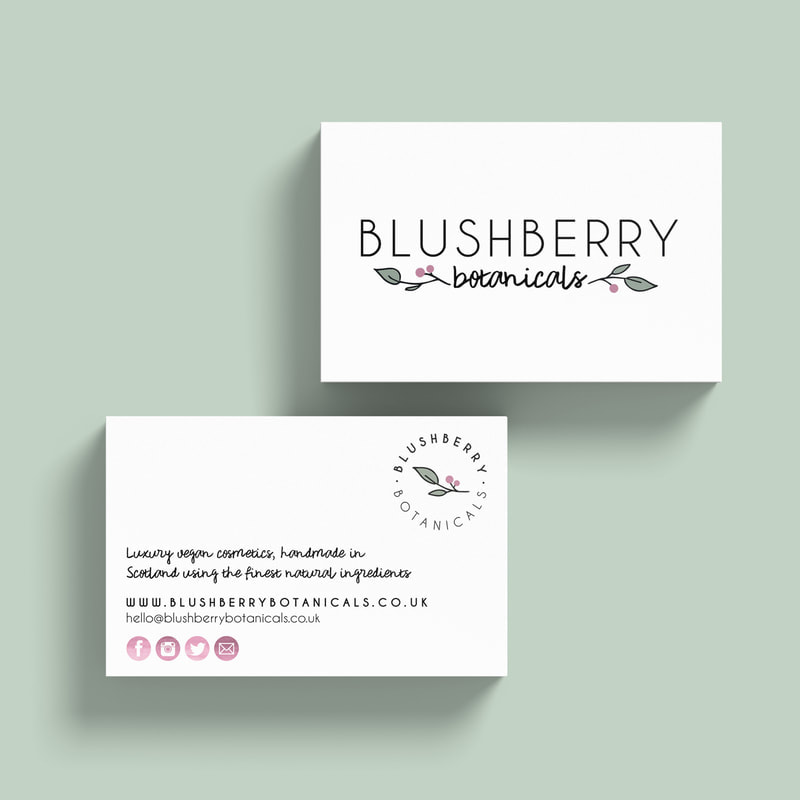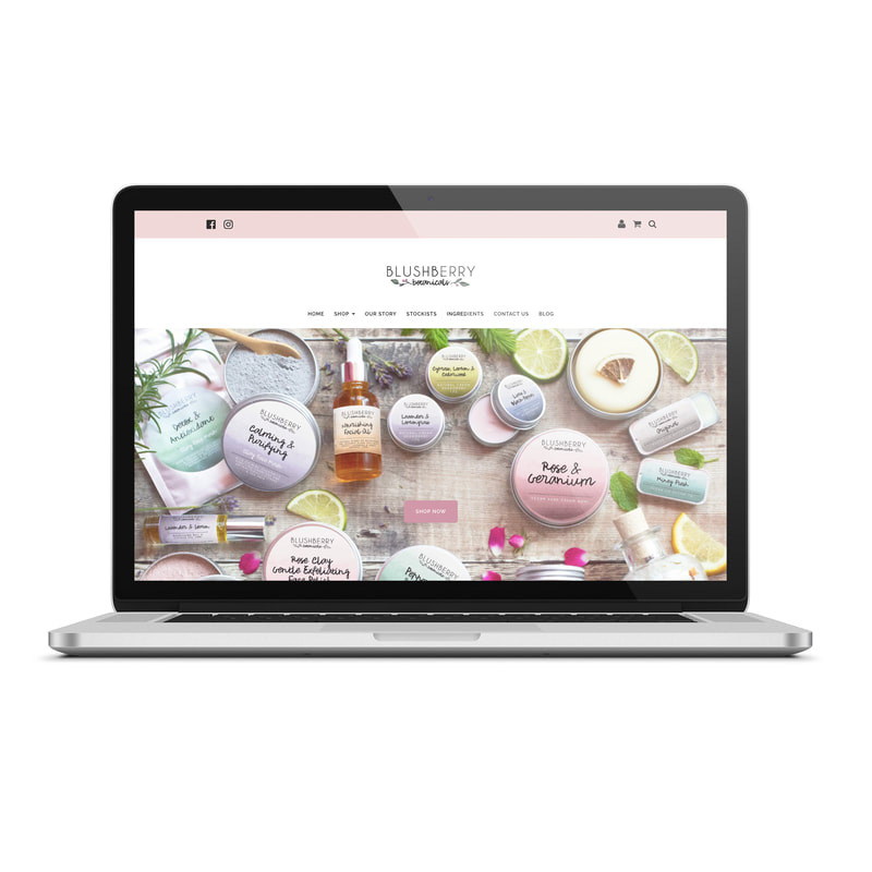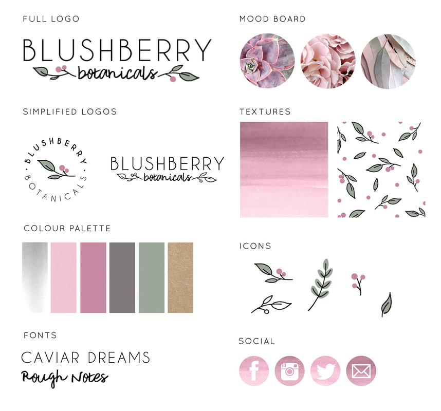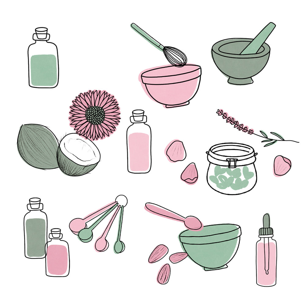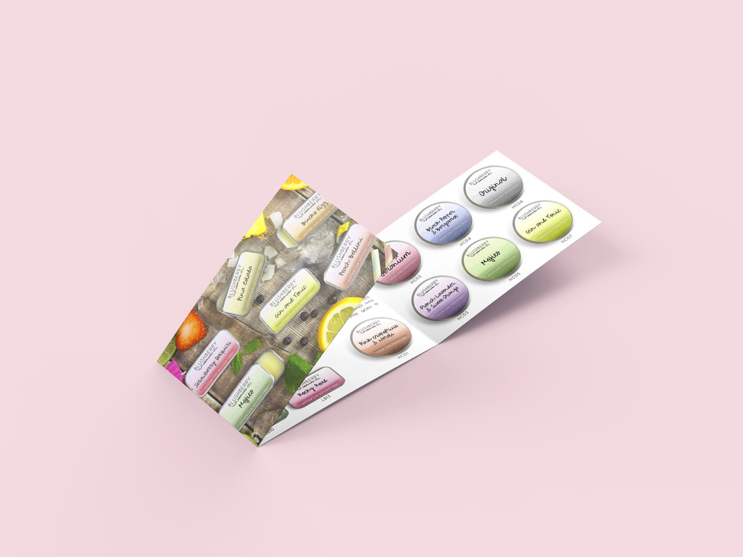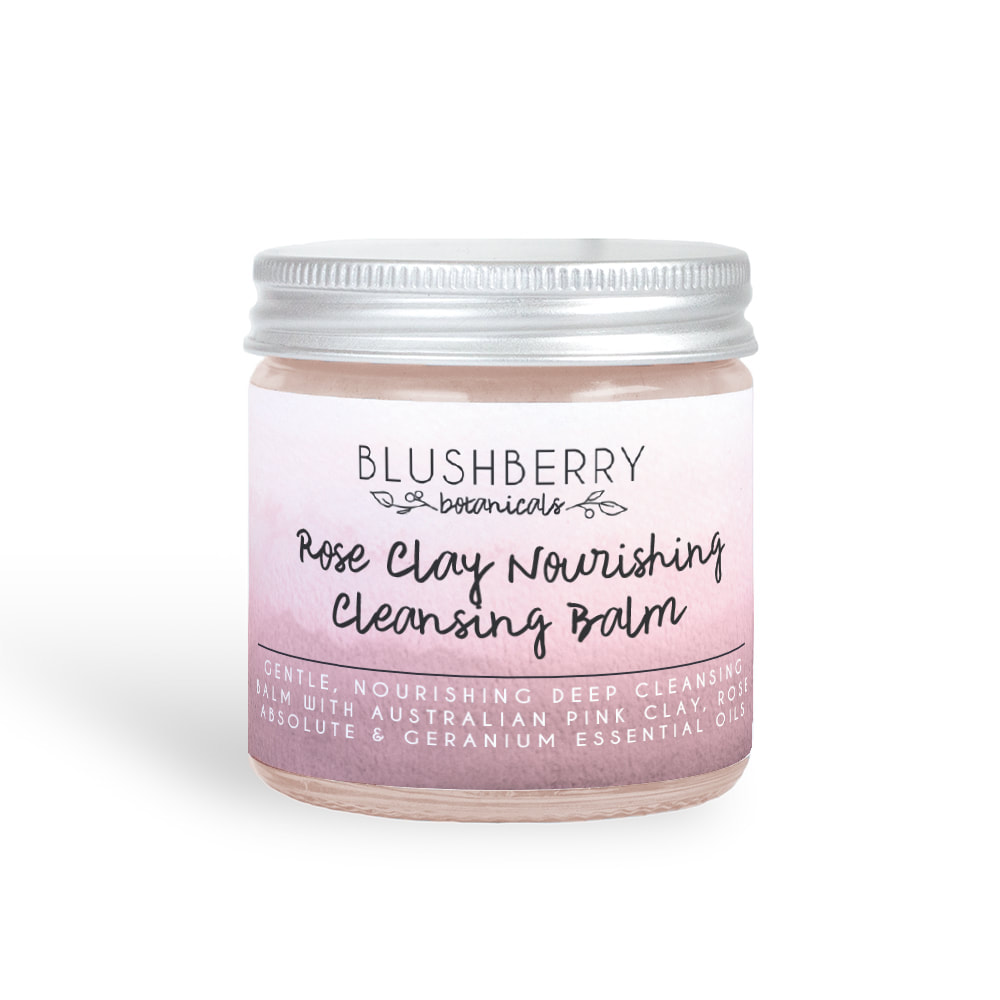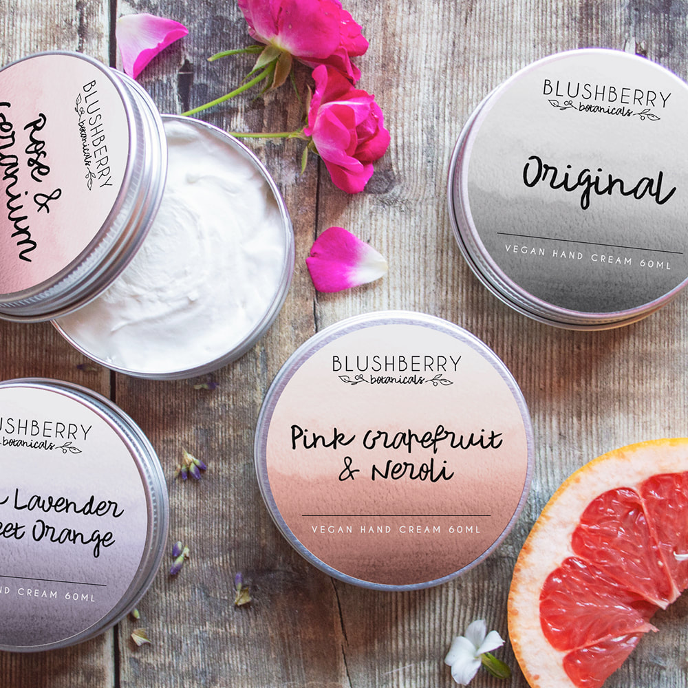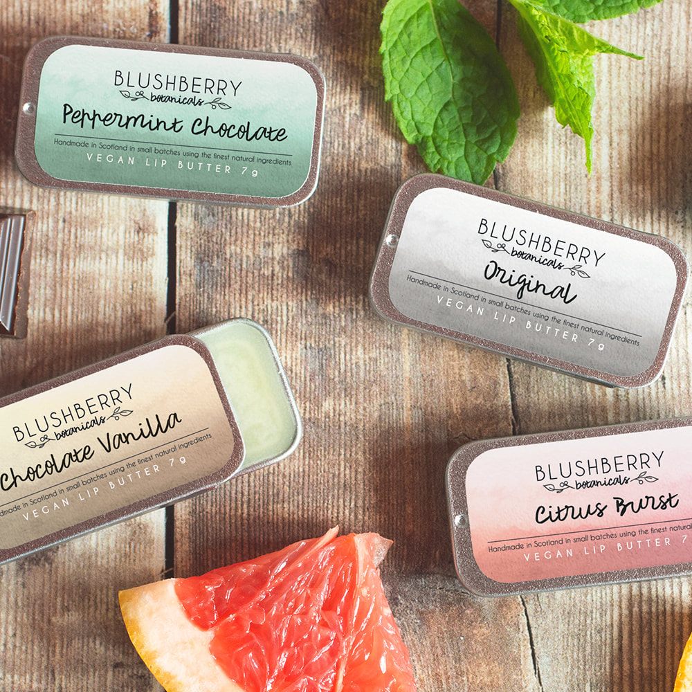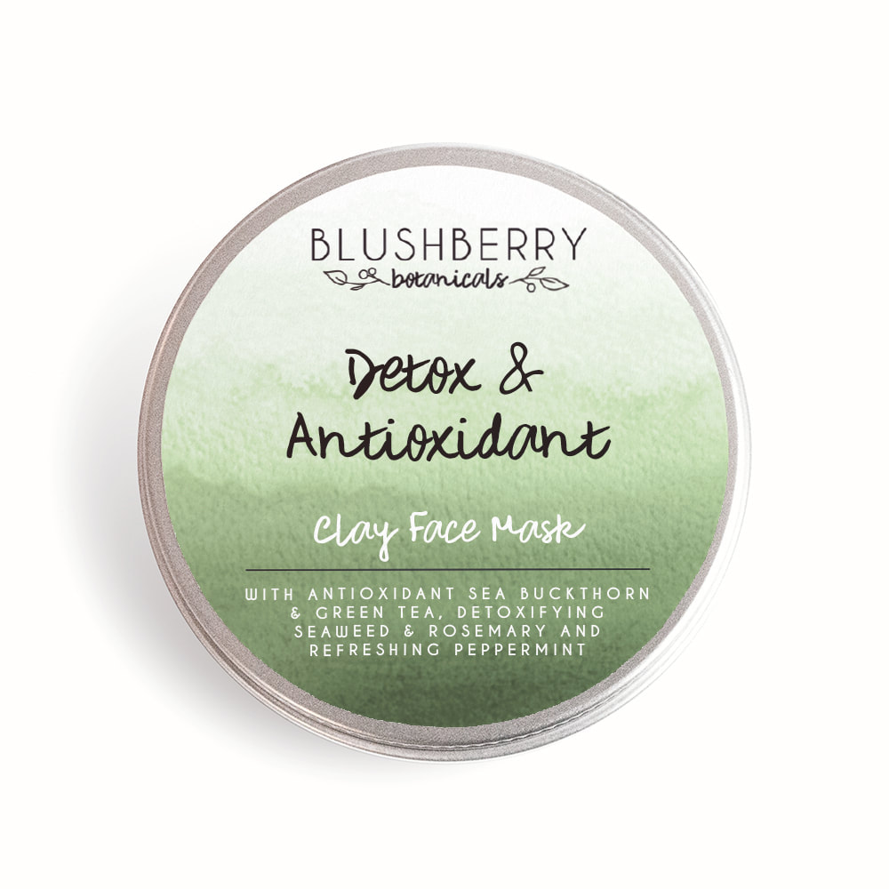
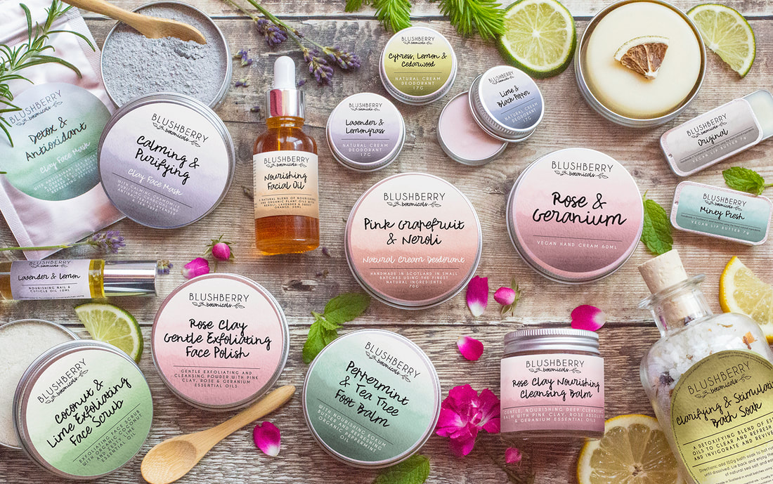
 Blushberry Botanicals is a luxury vegan cosmetics brand based in Scotland. They create a range of products using natural ingredients and small batch processes. The brand identity features a 'blush berry' sprig as a signature icon with contrasting fonts for a balance which reflects the minimal ingredients and the handmade nature of the products. The addition of a logo sub mark allows branding versatility whilst still being instantly recognisable. This brief required packaging design which would evolve with the growing product range and work across multiple label types. The colours reflect the key scents of each product and the soft watercolour gives them a fresh look. The client also required illustrated elements for use on the website which could also be used on social media infographics. After completing the packaging design we moved onto the product photography. We wanted to bring the scents and flavours of each item to life. It was a lot of fun sourcing and styling with these props to create vibrant and evocative imagery. I'm delighted with my brand design and product photographs and will continue to use Jilly for future collections. I receive compliments on my packaging and photos all of the time and have been featured in several press publications too! I wouldn't hesitate to recommend Jilly If you'd like to book a branding project or photoshoot you can do so here. 
0 Comments
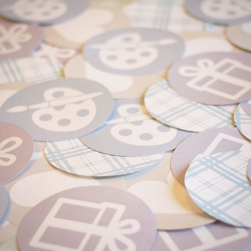
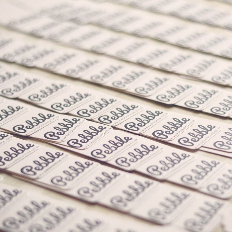
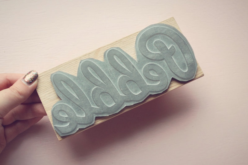
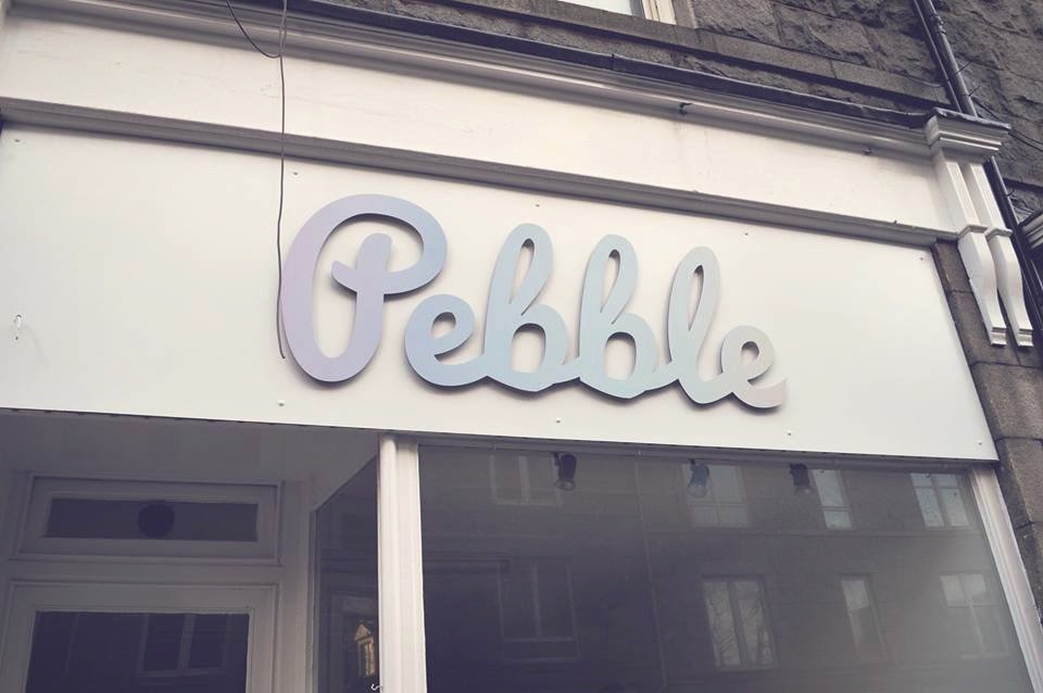
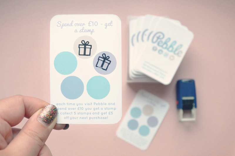
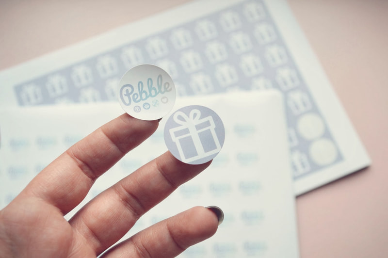
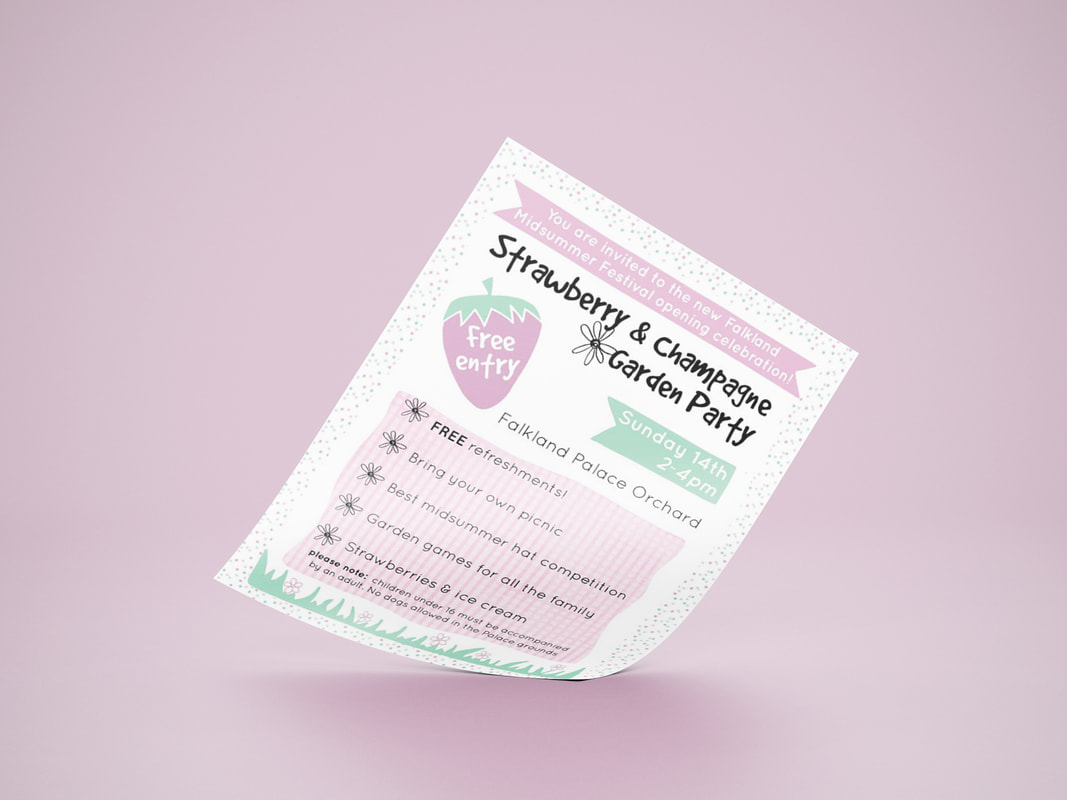
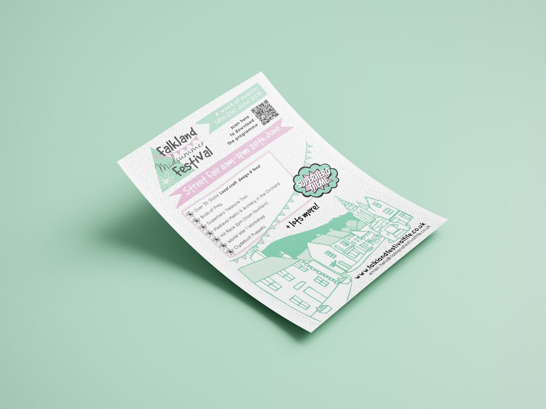
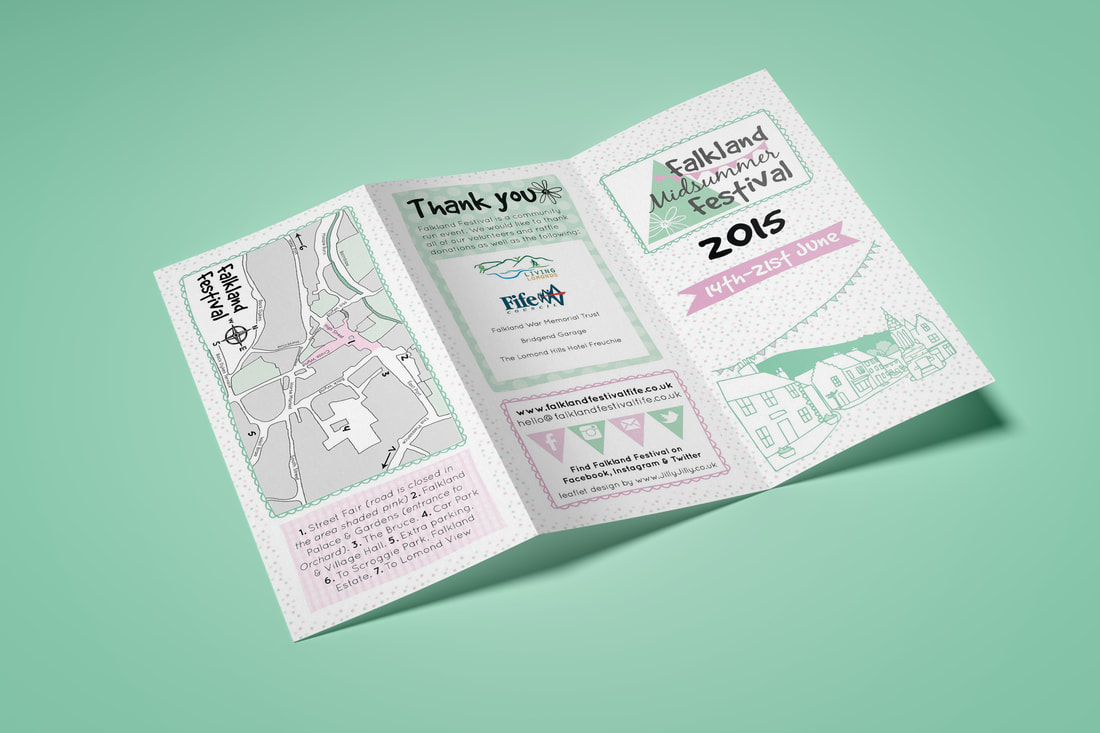
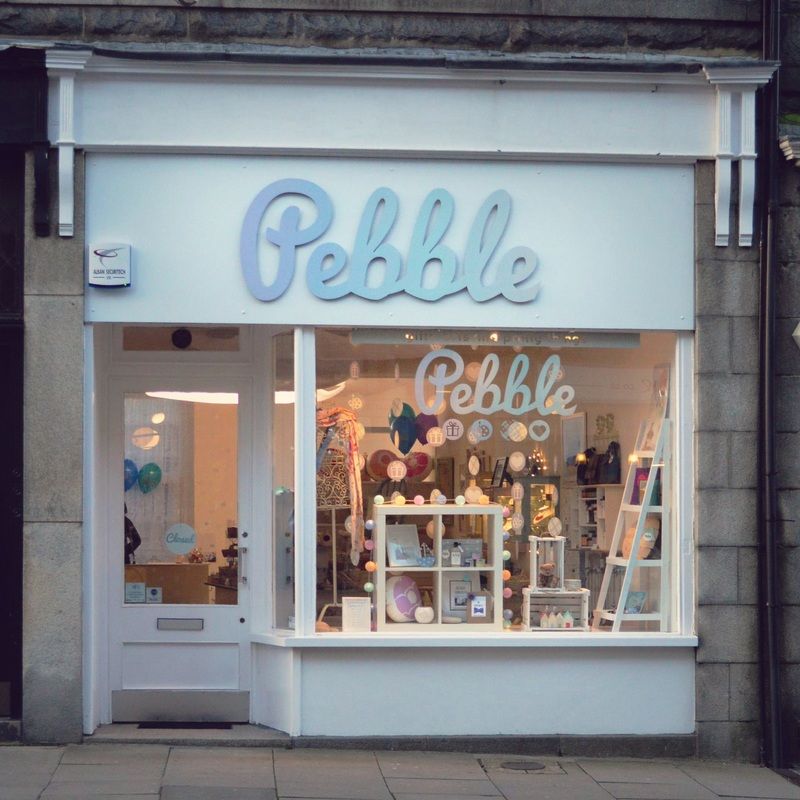 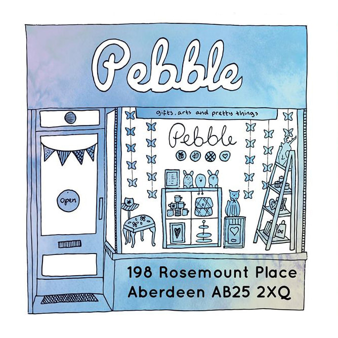 Pebble was an independent gift shop/gallery in Rosemount, Aberdeen which sold the work of Scottish designers and makers. It had the tagline: gifts, arts and pretty things. This was visually represented in the 'pebble' icons beneath the typography which were used throughout the branded items. The soft, ombre colour scheme was inspired by the coastal connections of the shop. The designs were used across the shop front from custom signage and vinyl window decal, to decorative hanging garlands and balloons for the opening weekend. Pebble offered gift wrapping and gift bags, so bespoke stamps and stickers were used to add a personal finishing touch. Pebble also commissioned an illustration to be used on flyers which represented their relationship with local designers more so than a photograph would. 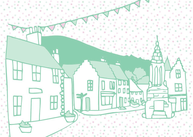 The Falkland Festival had a rebrand in 2015 and became the Falkland Midsummer Festival. The festival is a week of events put together by the community and businesses in Falkland. The picturesque village is decorated with bunting and there's lots of family friendly fun. We wanted the branding to have a really whimsical village garden party feel. The logo includes a geometric representation of the Falkland hill and village square bunting along with playful fonts. To compliment this, a simplified illustration of the iconic Falkland view was created which was then used throughout the festival promotional materials. The main programme was limited to a trifold flyer, it was put together with block patterned backgrounds for a patchwork effect which gave it the feel of a classic village fête. The decorative elements were to make it look fun for the whole family as many of the events were focussed on children's activities. If you'd like to book a rebrand you can do so here. |

HelloHere you'll find my latest projects, behind the scenes, tips, DIY projects and more! Categories
All
Past Posts
October 2023
|