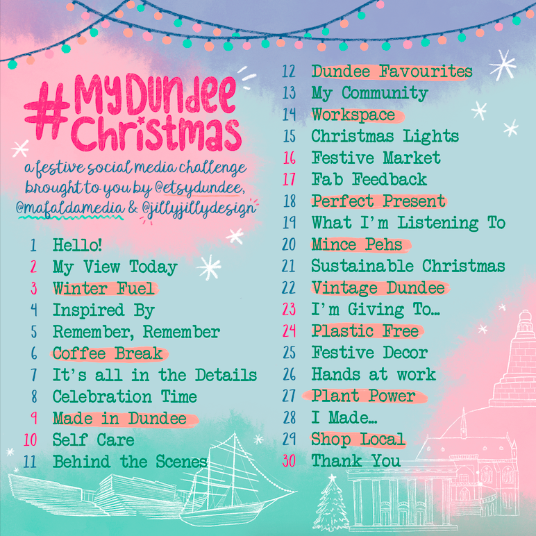
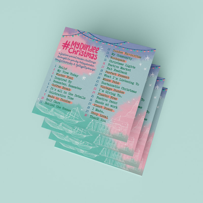
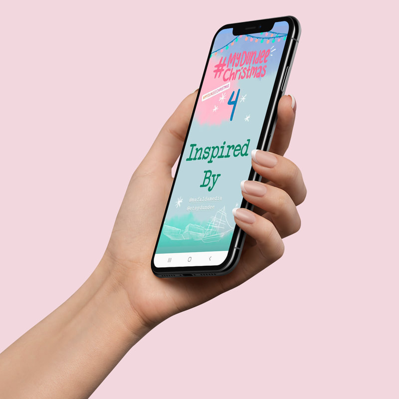
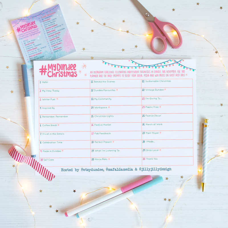
    #MyDundeeChristmas was a community social media challenge I worked on in 2019 in collaboration with Mafalda Media and the Dundee Etsy Team. The aim was for local indie businesses to boost their social media by following a series of daily prompts for the whole of November, with guest host days and prizes to be won. The graphics were an important part in spreading the word as we wanted it to look really fun and festive but not too 'Christmassy' as we began promotion in October. We started with the prompt list which was also printed as square flyers. I then designed a printable planner for those taking part to plan out their posts, and a series of countdown and cover graphics for use across social media throughout the challenge. 
0 Comments
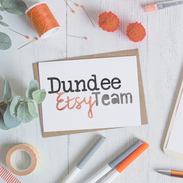
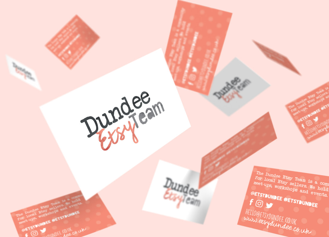
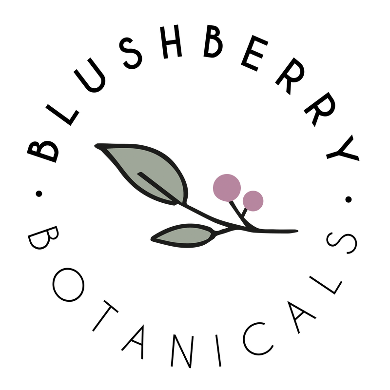
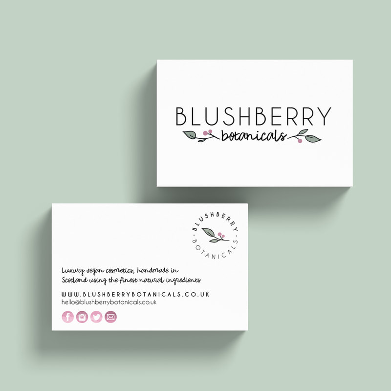
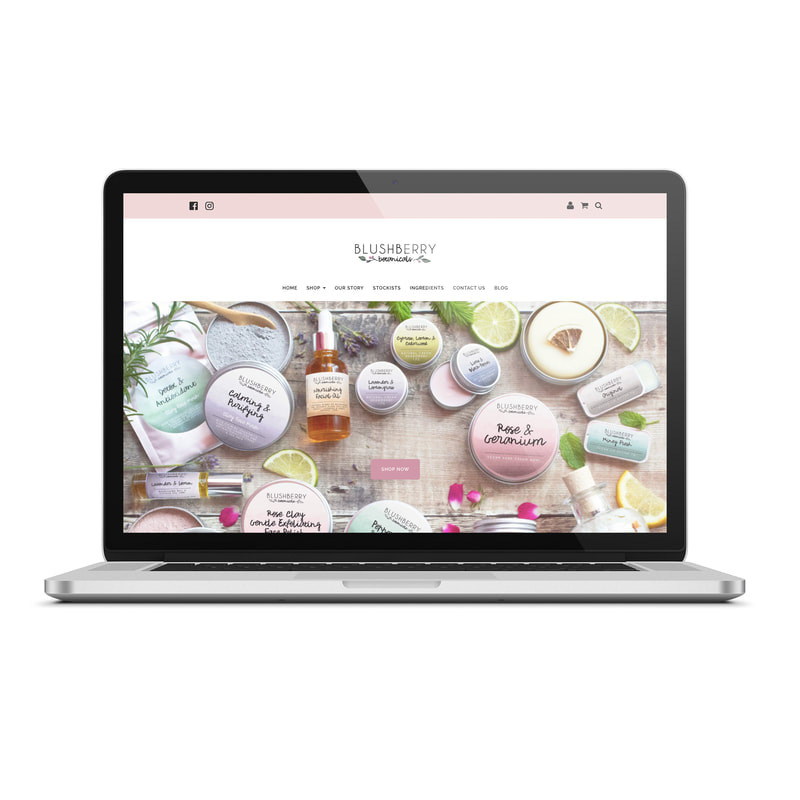
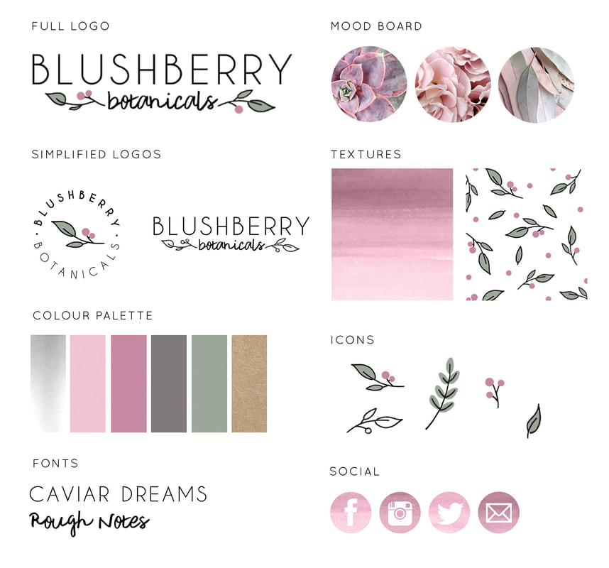
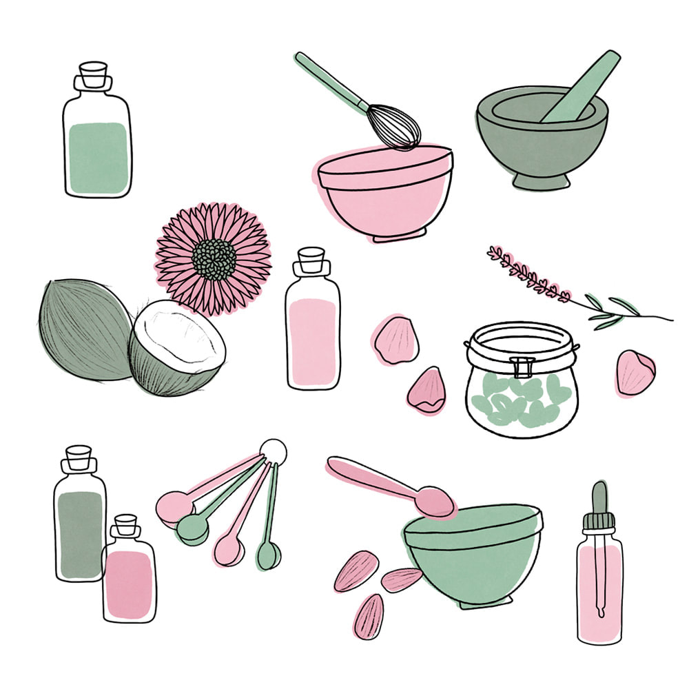
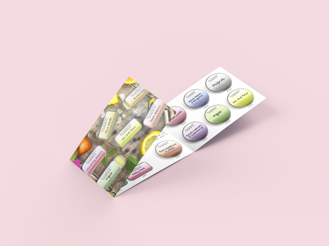
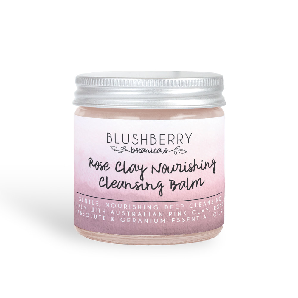
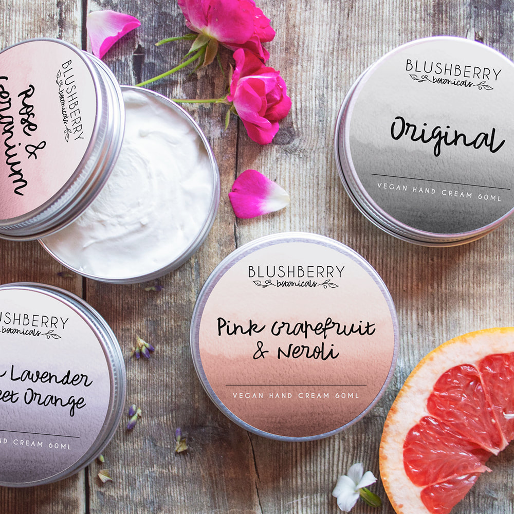
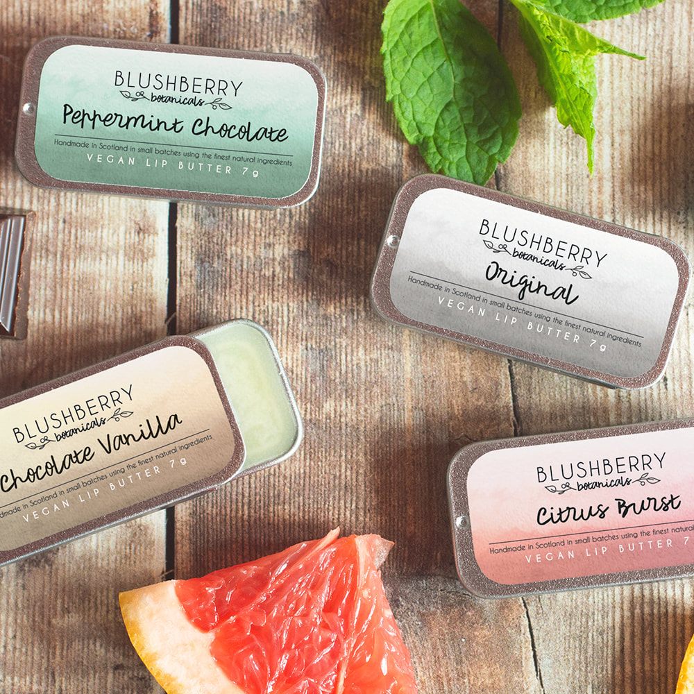
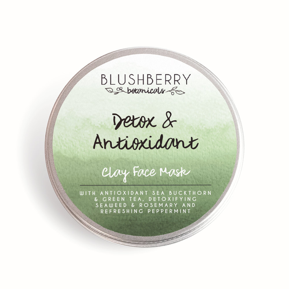
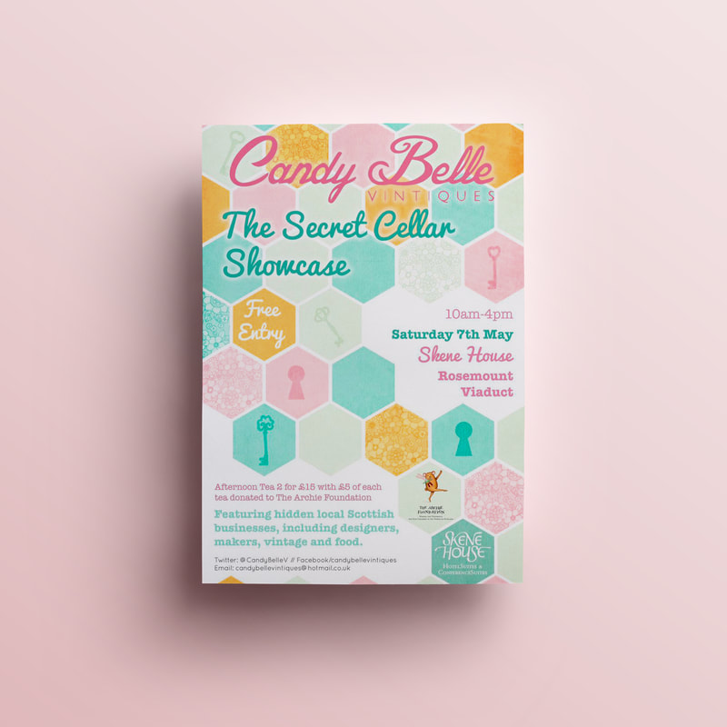
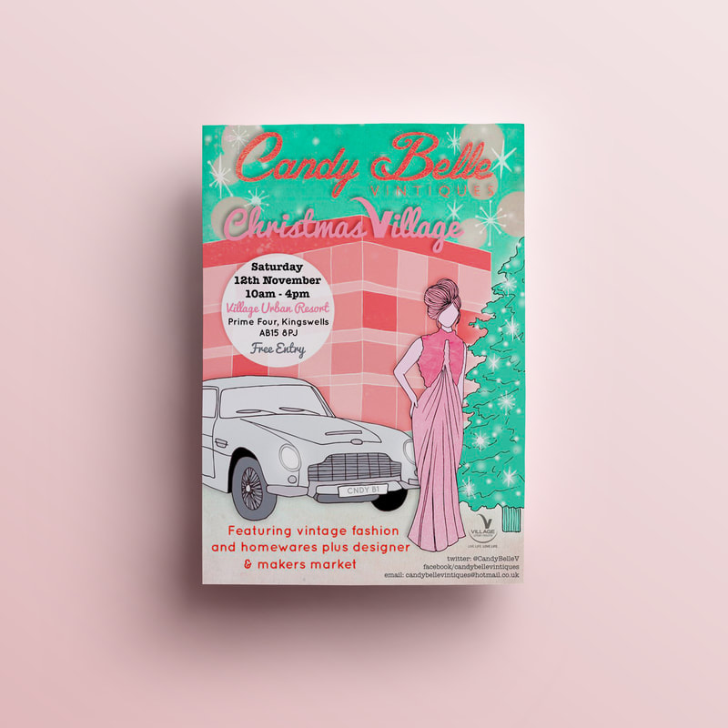
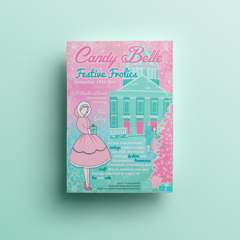
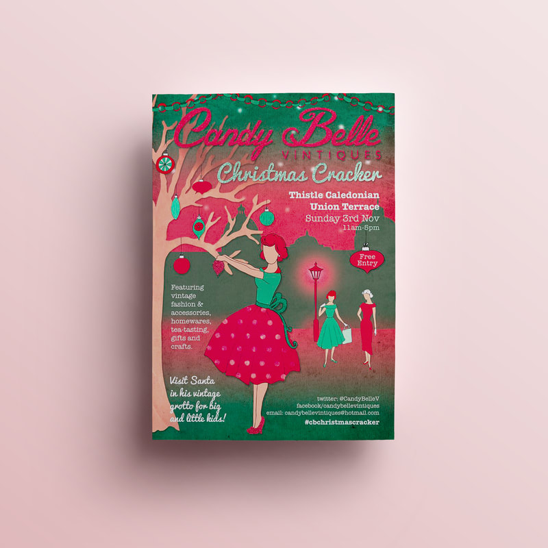
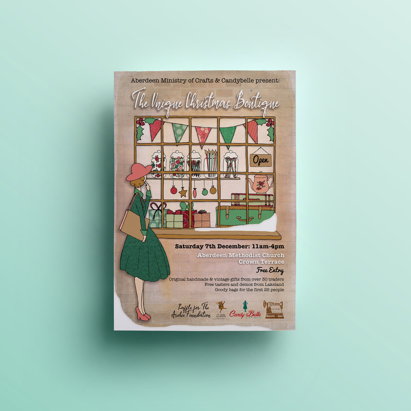
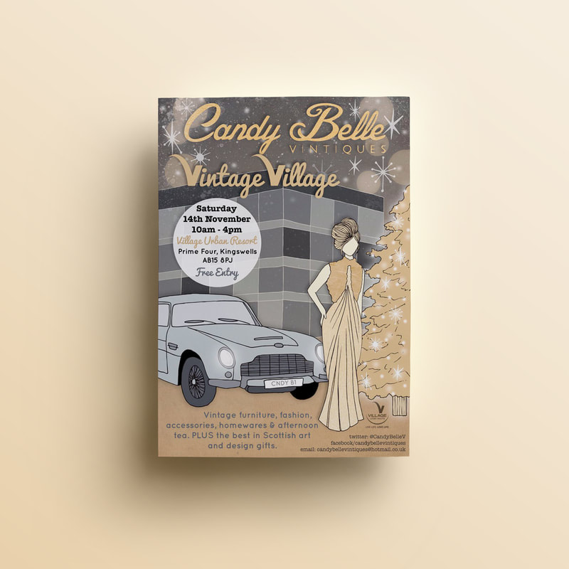
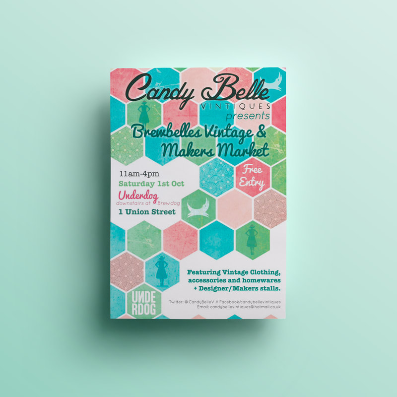
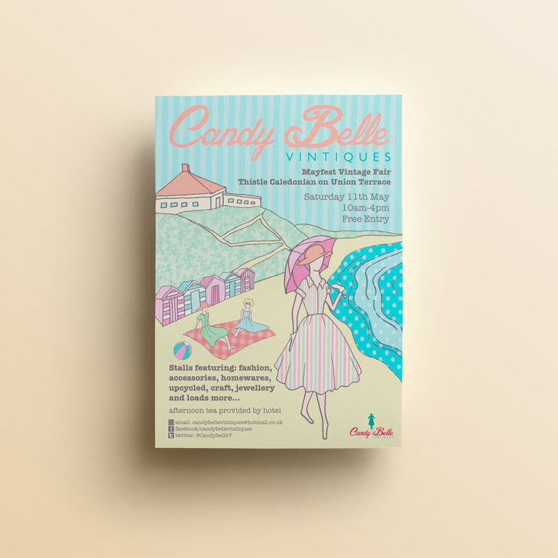
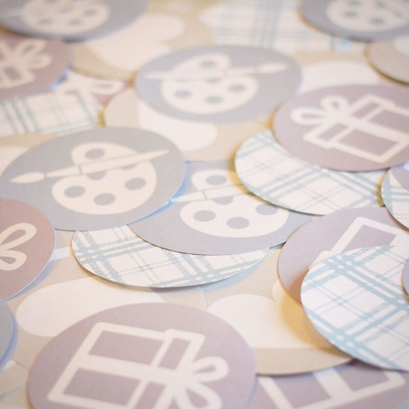
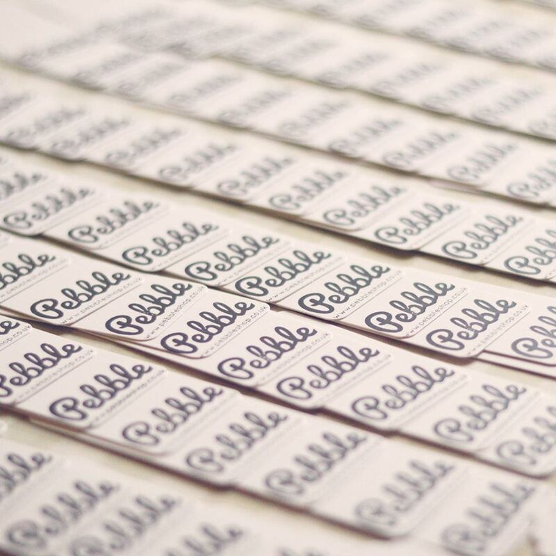
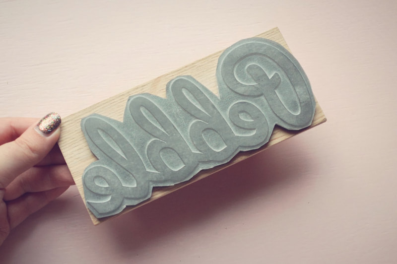
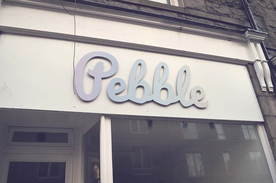
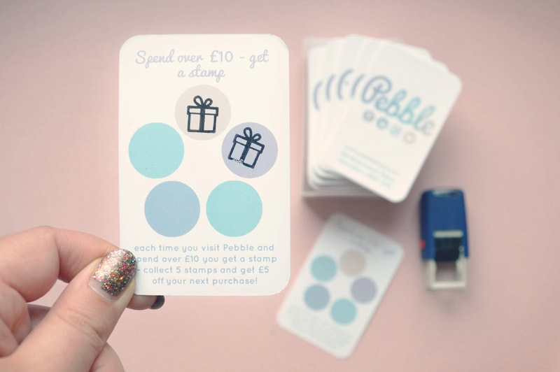
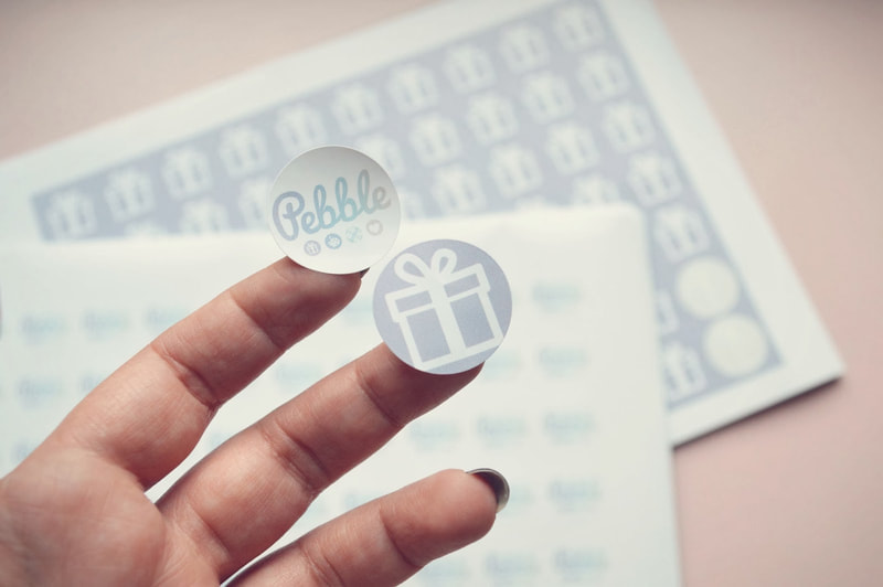
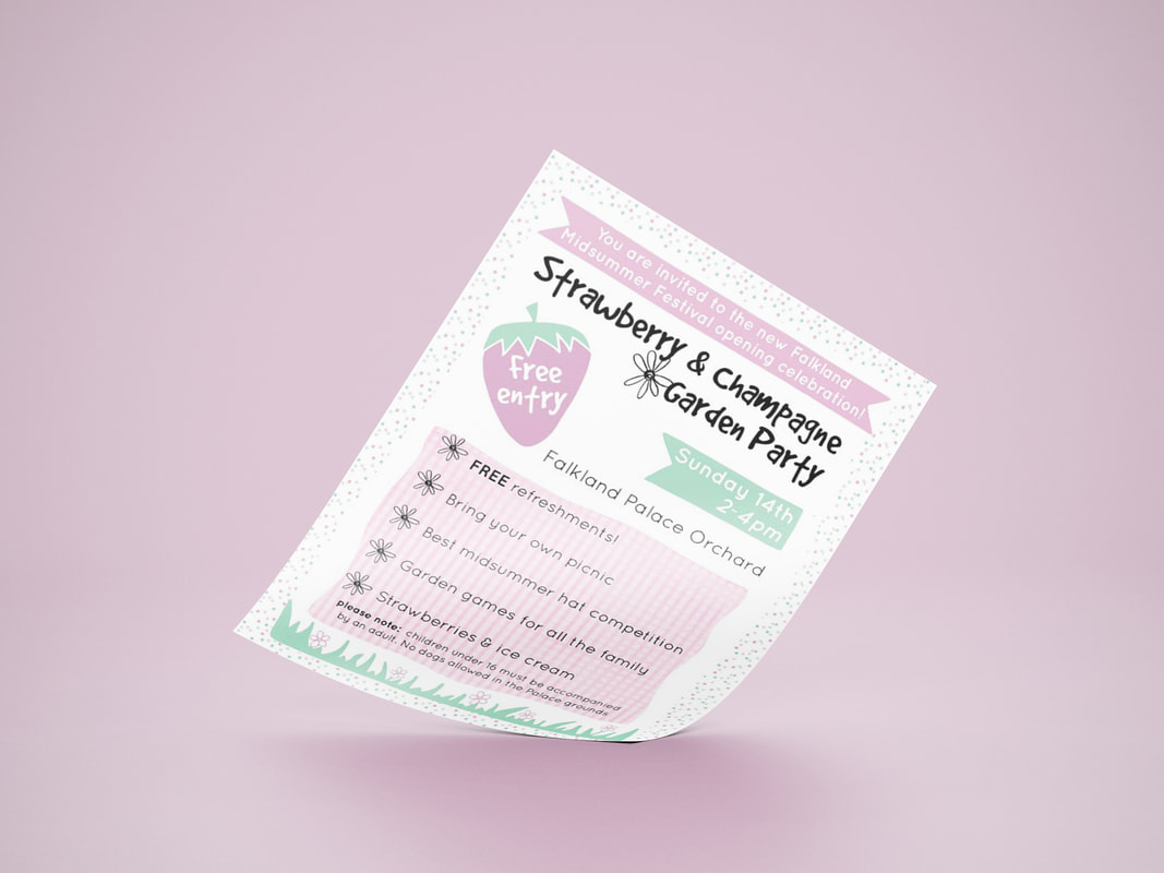
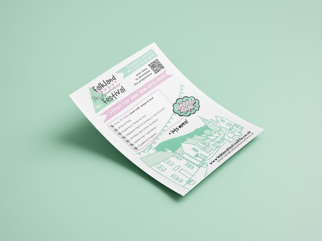
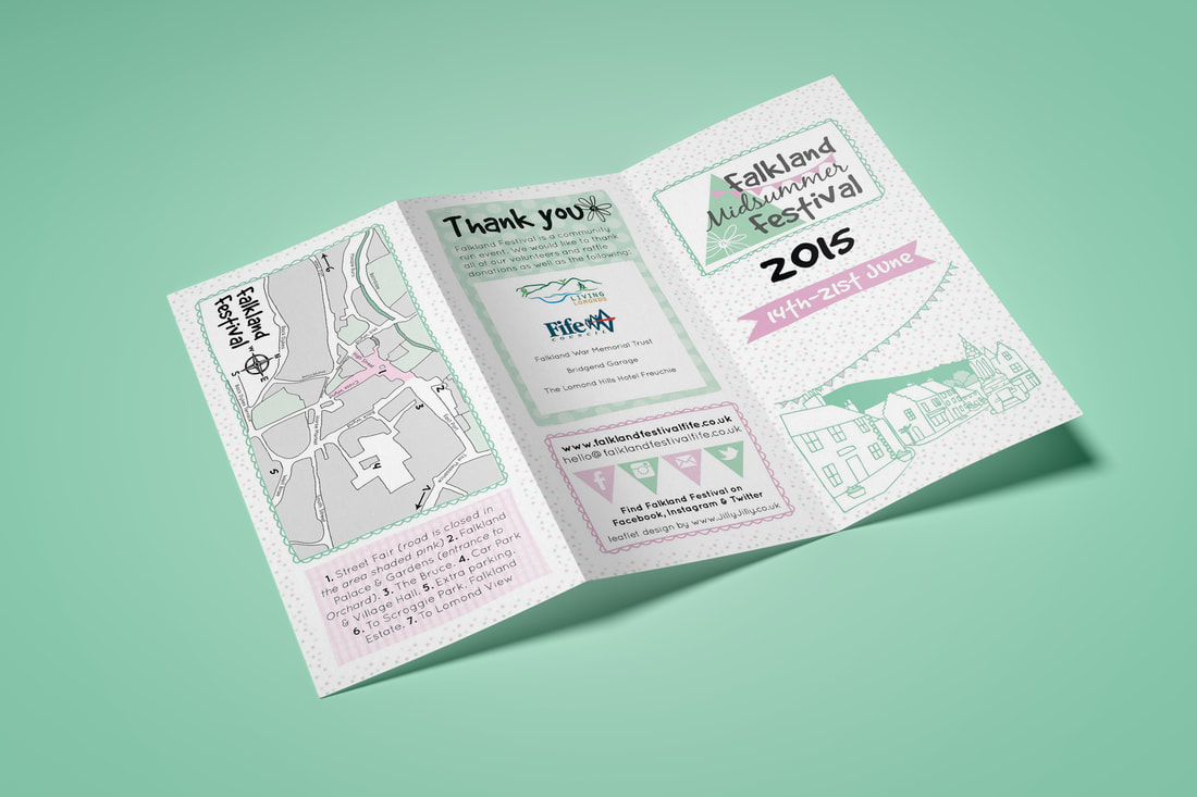
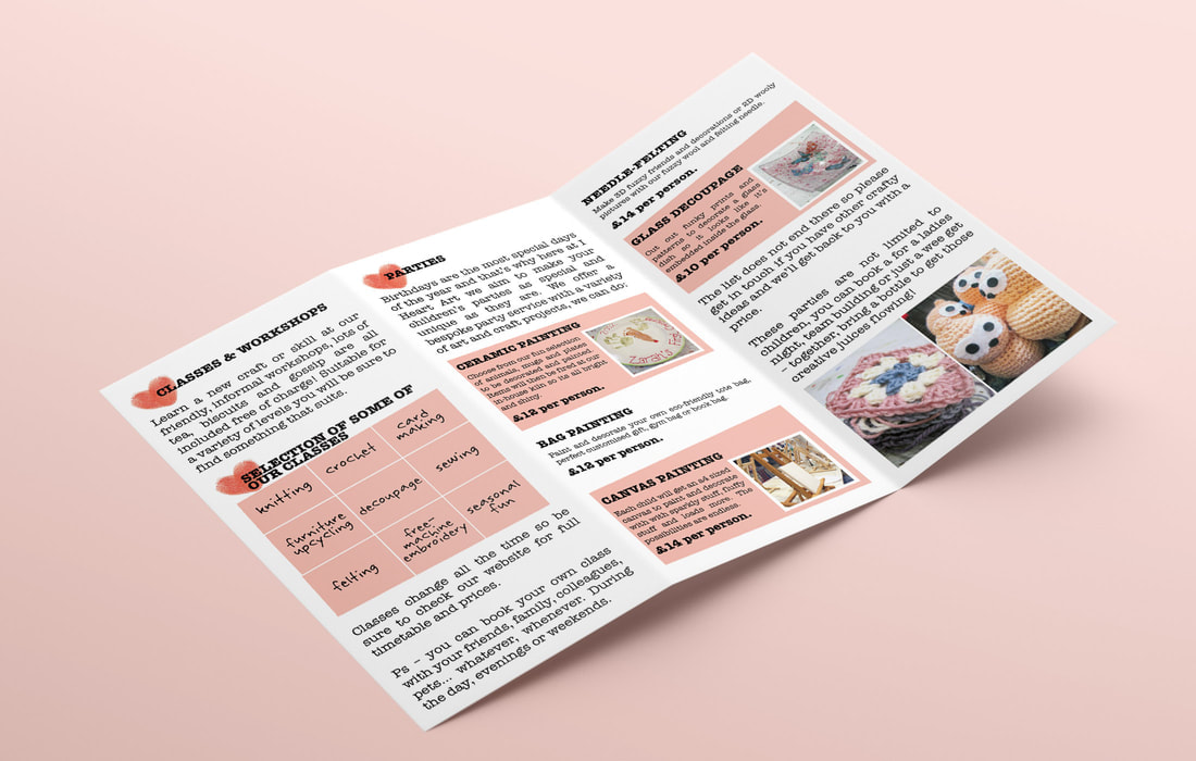
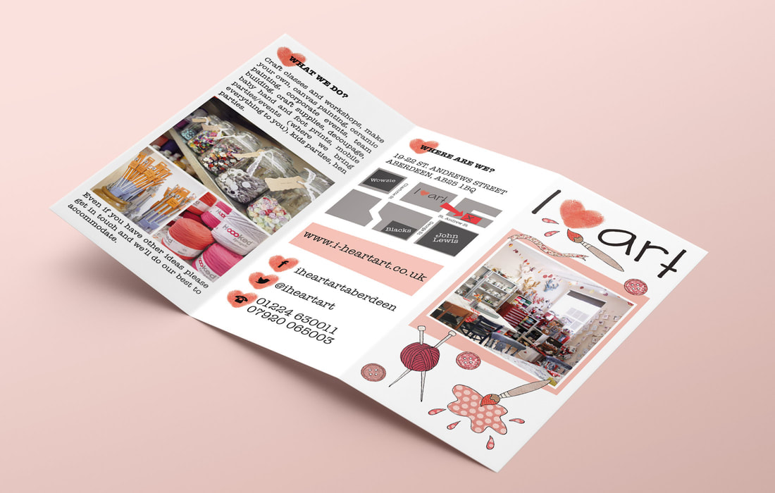
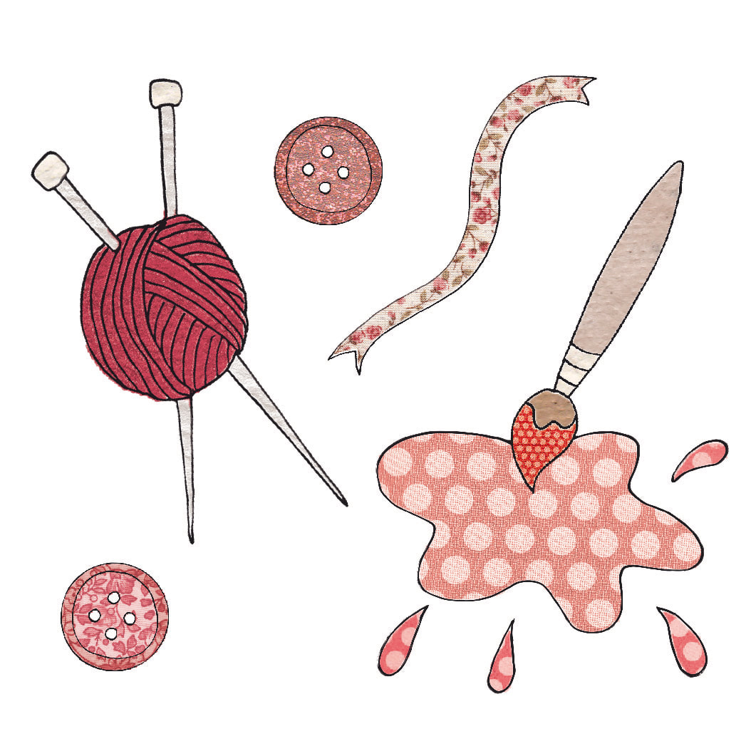
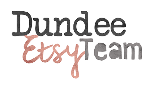 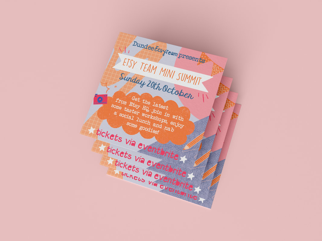 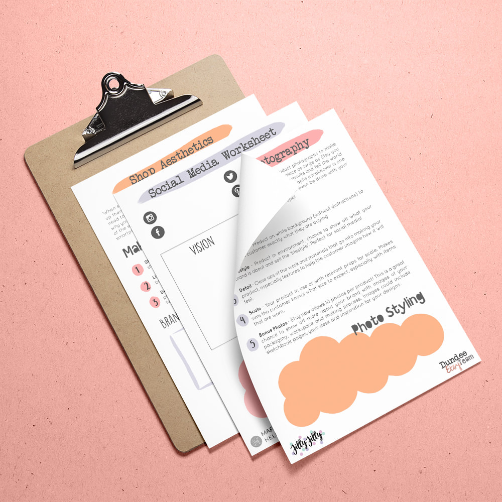 The Dundee Etsy Team is a community group for local Etsy sellers who hold meet ups, workshops and events. Etsy teams cannot use the official Etsy logo but may take inspiration to make their own team branding. This meant that orange needed to be a key feature of this branding. This was then paired with a mix of fonts associated with craft - typewritten with a vintage feel, calligraphy and 'papercut' style. Over the years I've also created promotional graphics for the Dundee Etsy Team events, workshop hand outs and goody bag accessories. These all have different hand drawn elements and patterns for a creative mismatched vibe but use the same colours and fonts throughout to keep some consistency. If you'd like to book a branding project or for some custom graphics and workbooks, you can do so here. 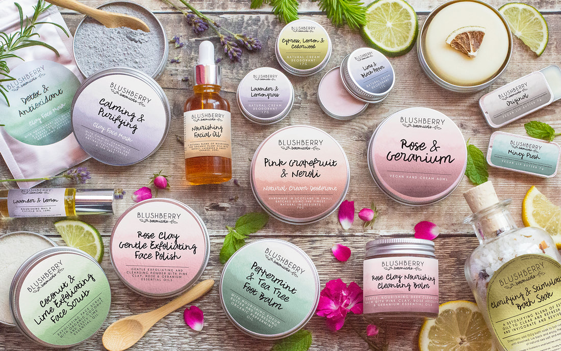 Blushberry Botanicals is a luxury vegan cosmetics brand based in Scotland. They create a range of products using natural ingredients and small batch processes. The brand identity features a 'blush berry' sprig as a signature icon with contrasting fonts for a balance which reflects the minimal ingredients and the handmade nature of the products. The addition of a logo sub mark allows branding versatility whilst still being instantly recognisable. This brief required packaging design which would evolve with the growing product range and work across multiple label types. The colours reflect the key scents of each product and the soft watercolour gives them a fresh look. The client also required illustrated elements for use on the website which could also be used on social media infographics. After completing the packaging design we moved onto the product photography. We wanted to bring the scents and flavours of each item to life. It was a lot of fun sourcing and styling with these props to create vibrant and evocative imagery. I'm delighted with my brand design and product photographs and will continue to use Jilly for future collections. I receive compliments on my packaging and photos all of the time and have been featured in several press publications too! I wouldn't hesitate to recommend Jilly If you'd like to book a branding project or photoshoot you can do so here. Candy Belle Vintiques hosted Aberdeenshire's favourite vintage pop up markets. Their events had a huge following of vintage treasure hunters. They featured a wide array of curated stalls which also included local designers and makers. I designed many of their event posters, each with a different themed brief and colour palette. They were known for the vintage ladies who featured on the posters which were based on classic sewing pattern illustrations. Some featured Aberdeen landmarks in the background too. If you'd like to book a poster design project you can do so here. 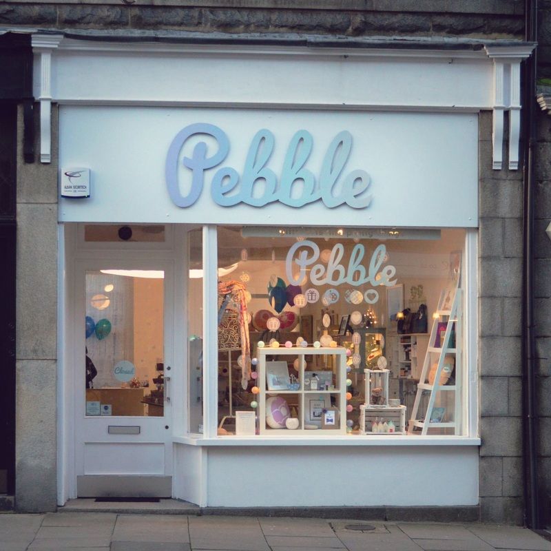 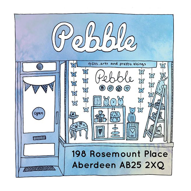 Pebble was an independent gift shop/gallery in Rosemount, Aberdeen which sold the work of Scottish designers and makers. It had the tagline: gifts, arts and pretty things. This was visually represented in the 'pebble' icons beneath the typography which were used throughout the branded items. The soft, ombre colour scheme was inspired by the coastal connections of the shop. The designs were used across the shop front from custom signage and vinyl window decal, to decorative hanging garlands and balloons for the opening weekend. Pebble offered gift wrapping and gift bags, so bespoke stamps and stickers were used to add a personal finishing touch. Pebble also commissioned an illustration to be used on flyers which represented their relationship with local designers more so than a photograph would.  The Falkland Festival had a rebrand in 2015 and became the Falkland Midsummer Festival. The festival is a week of events put together by the community and businesses in Falkland. The picturesque village is decorated with bunting and there's lots of family friendly fun. We wanted the branding to have a really whimsical village garden party feel. The logo includes a geometric representation of the Falkland hill and village square bunting along with playful fonts. To compliment this, a simplified illustration of the iconic Falkland view was created which was then used throughout the festival promotional materials. The main programme was limited to a trifold flyer, it was put together with block patterned backgrounds for a patchwork effect which gave it the feel of a classic village fête. The decorative elements were to make it look fun for the whole family as many of the events were focussed on children's activities. If you'd like to book a rebrand you can do so here. I Heart Art was an arts and crafts studio in Aberdeen specialising in ceramic painting, crafty workshops and art classes. The owners were also big fans of vintage and upcycling so there was a lot of information to squeeze into one flyer! In the end, the design was kept quite minimal with colour blocks to help split the text sections. Since the logo was already very handmade looking I created some illustrations to compliment the style. These had patterned infills, including vintage floral fabrics to add to the crafty theme. If you'd like a similar style flyer designed you can get in touch here. Lisa Grace specialised in bespoke wedding stationery. The brief was to create an elegant yet simple logo, inspired by traditional wedding styles but with a modern feel. The calligraphy fonts gave a classic bridal look, paired a looped heart for a romantic vibe. As well as the logo, Lisa required design for business cards, stickers for orders and repeat pattern elements for packing up invitations with a personal touch. |
HelloHere you'll find my latest projects, behind the scenes, tips, DIY projects and more! Categories
All
Past Posts
October 2023
|