|
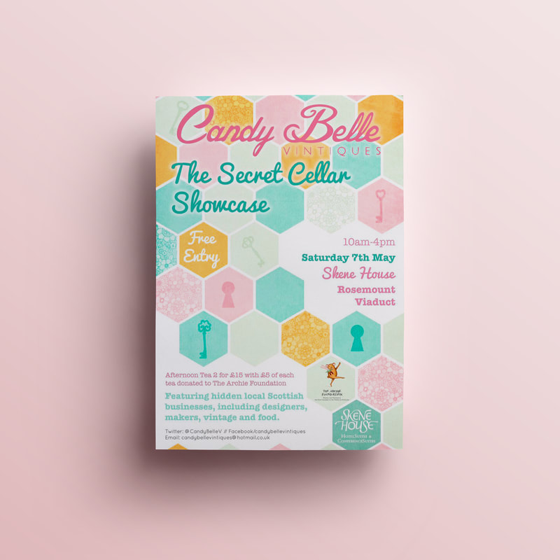
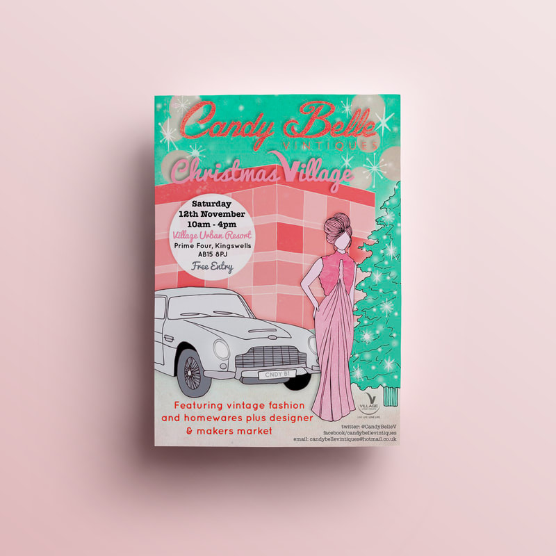
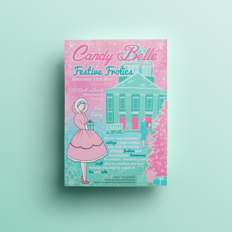
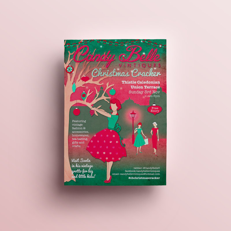
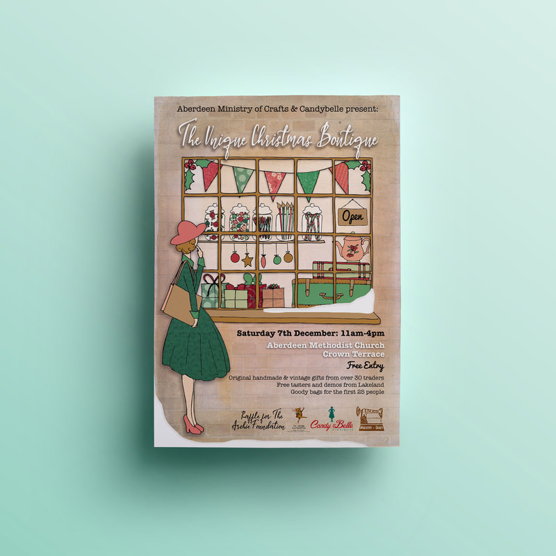
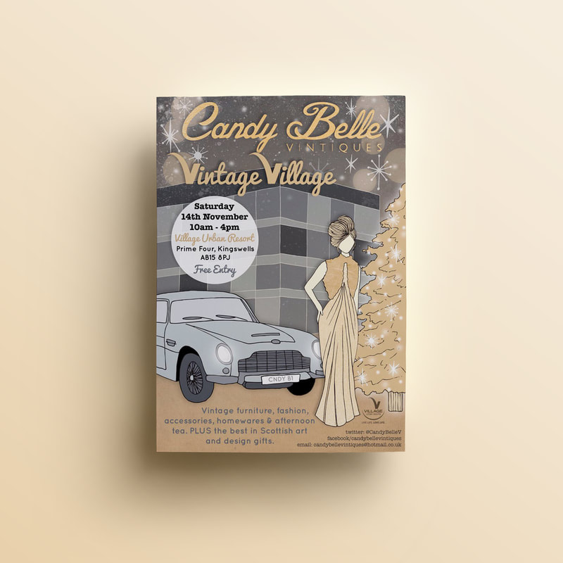
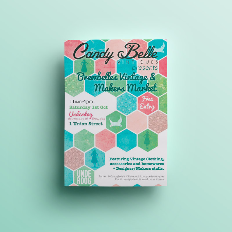
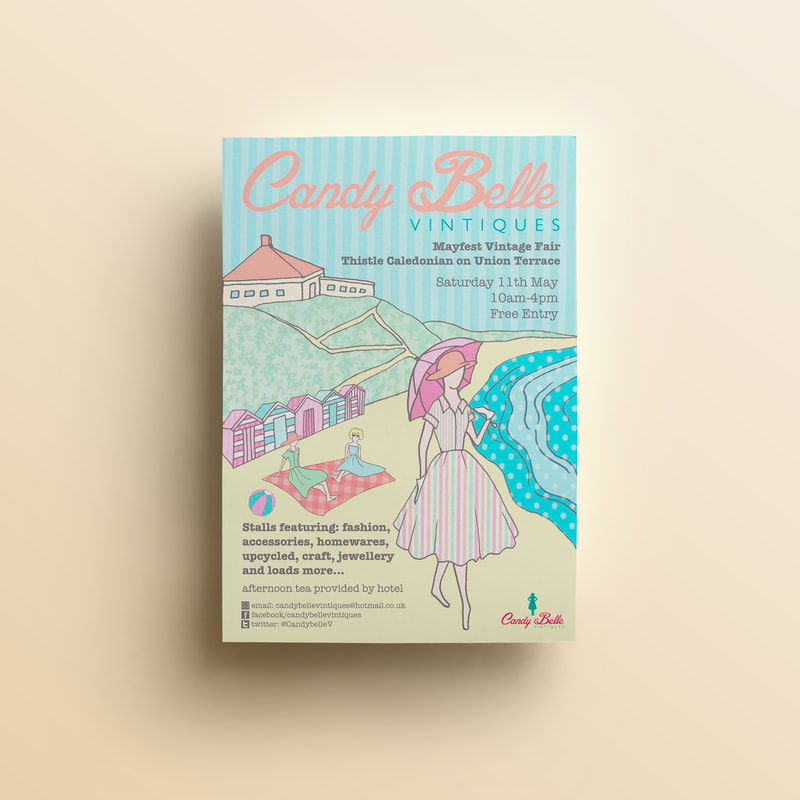
Candy Belle Vintiques hosted Aberdeenshire's favourite vintage pop up markets. Their events had a huge following of vintage treasure hunters. They featured a wide array of curated stalls which also included local designers and makers. I designed many of their event posters, each with a different themed brief and colour palette. They were known for the vintage ladies who featured on the posters which were based on classic sewing pattern illustrations. Some featured Aberdeen landmarks in the background too. If you'd like to book a poster design project you can do so here. 
0 Comments
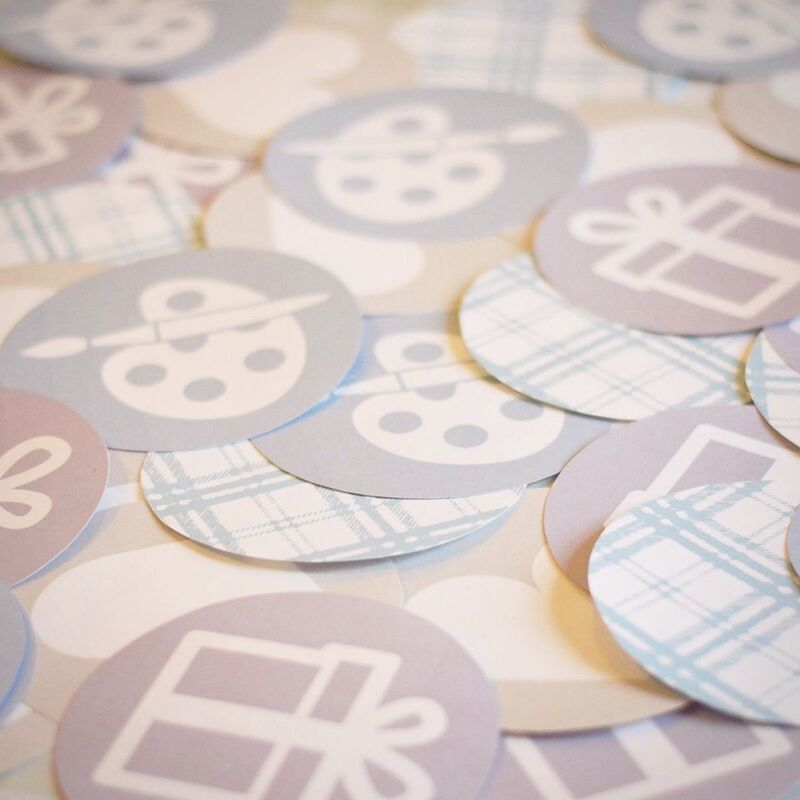
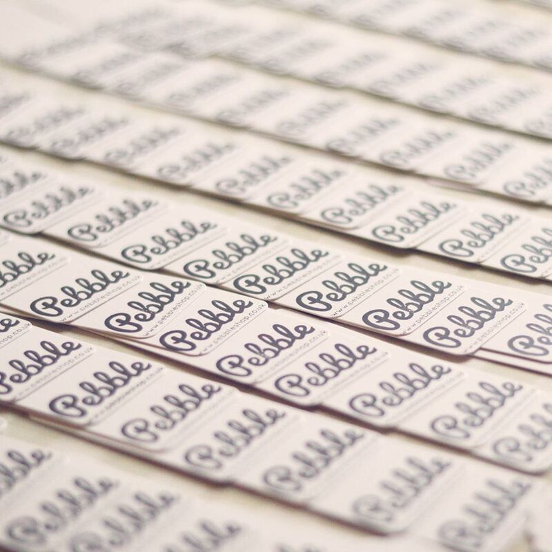
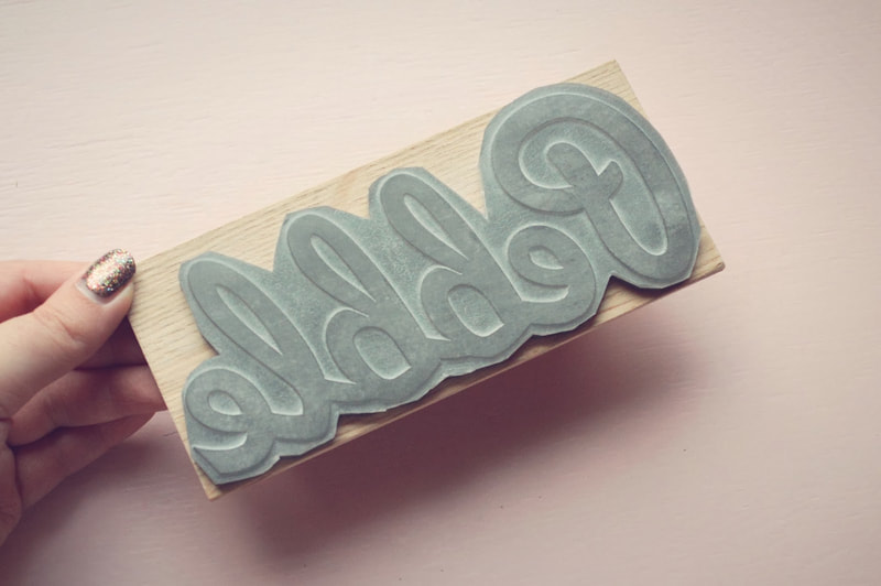
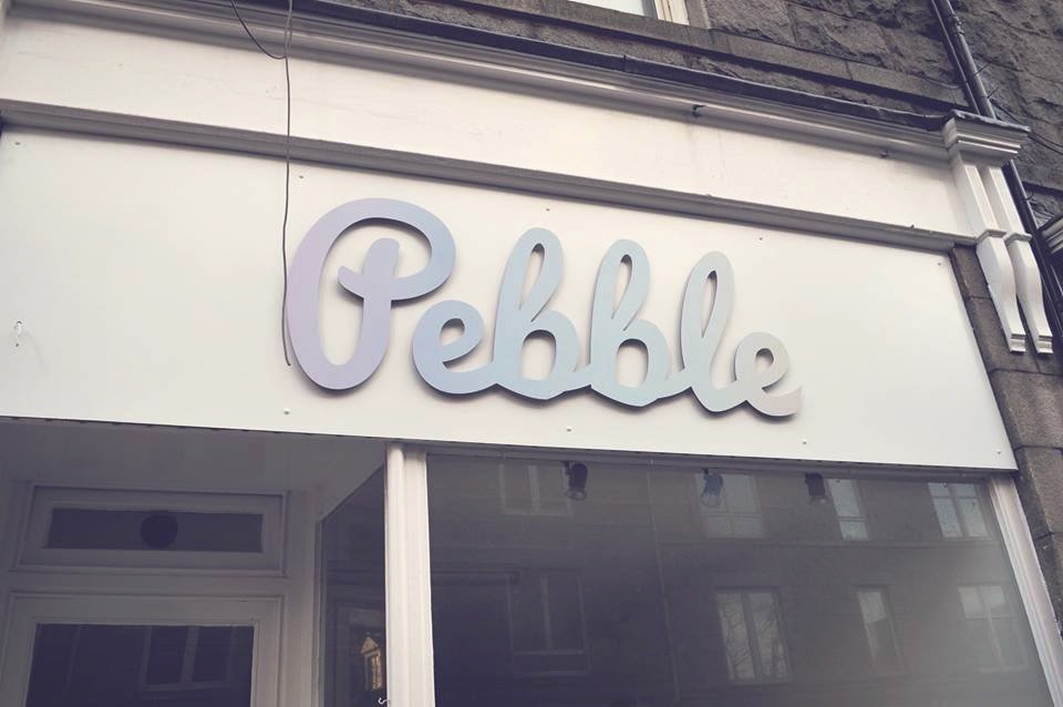
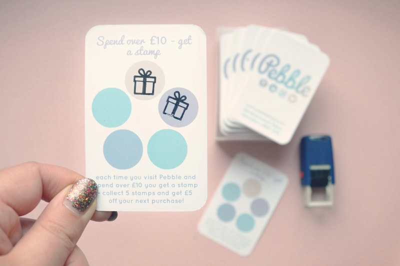
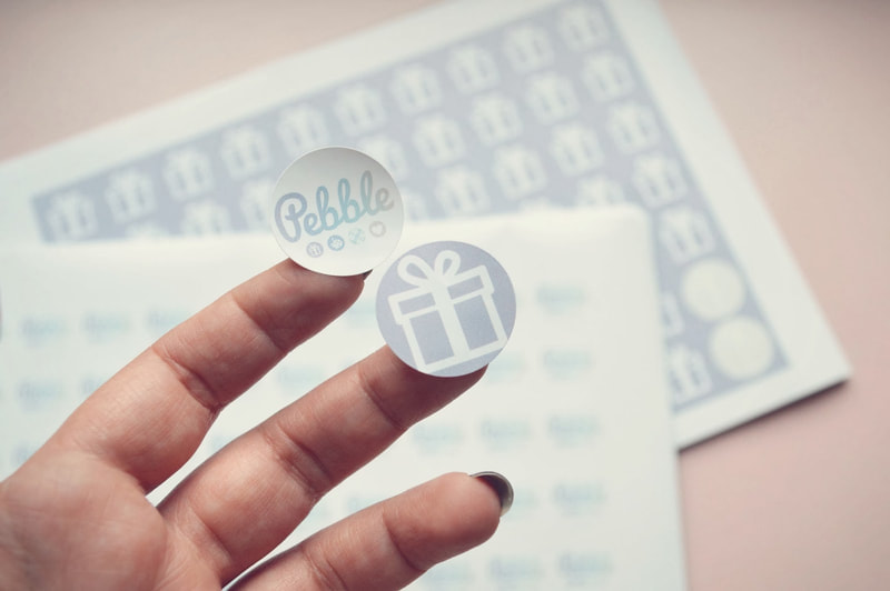
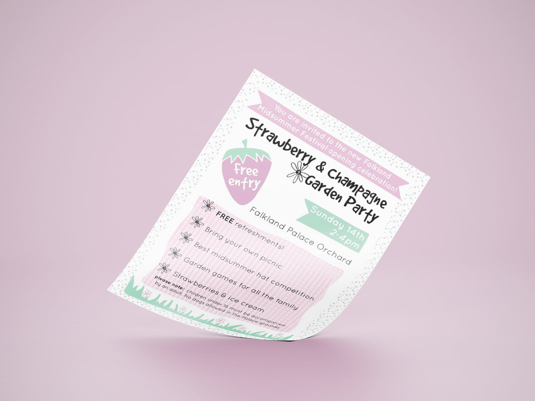
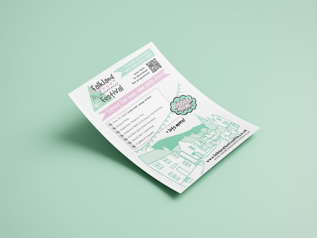
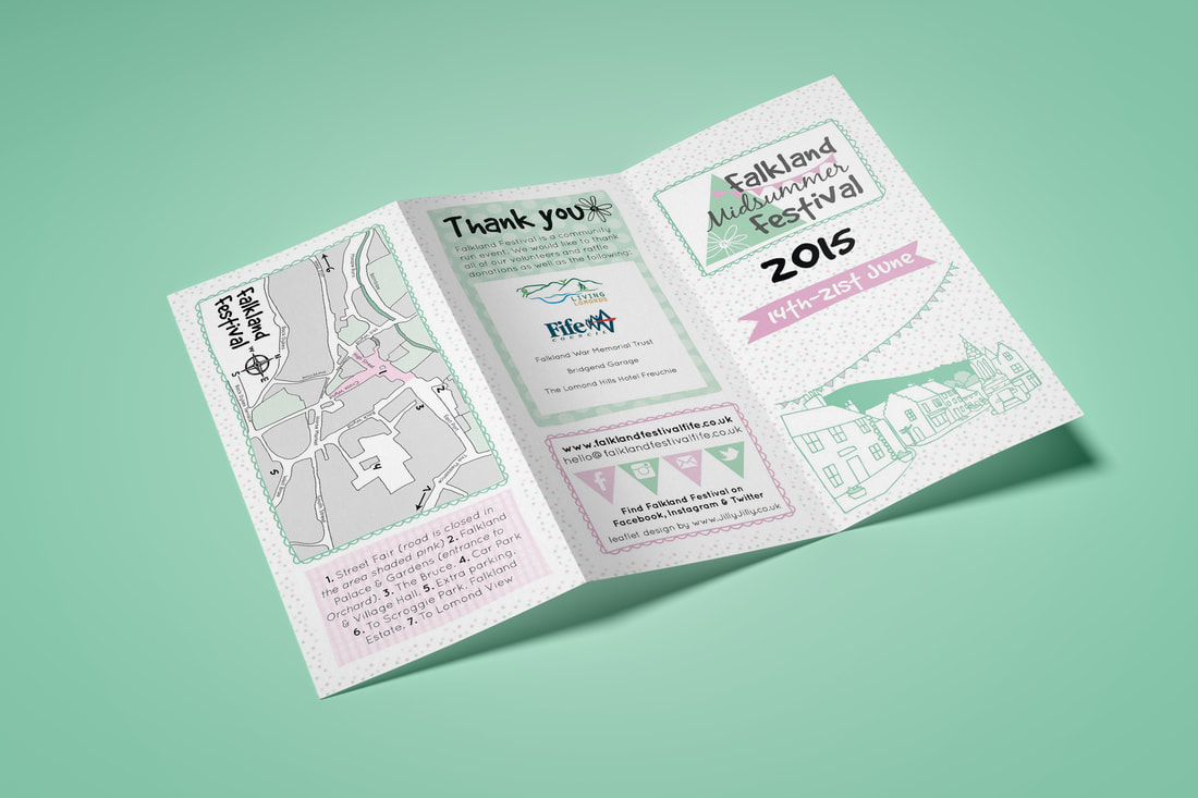
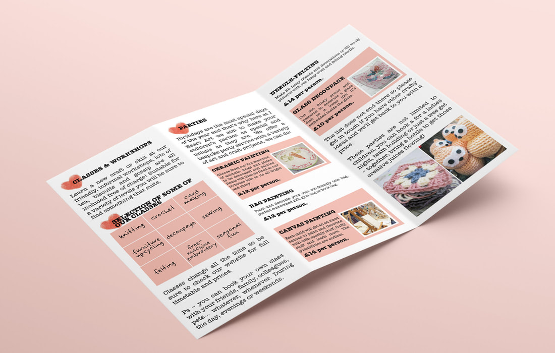
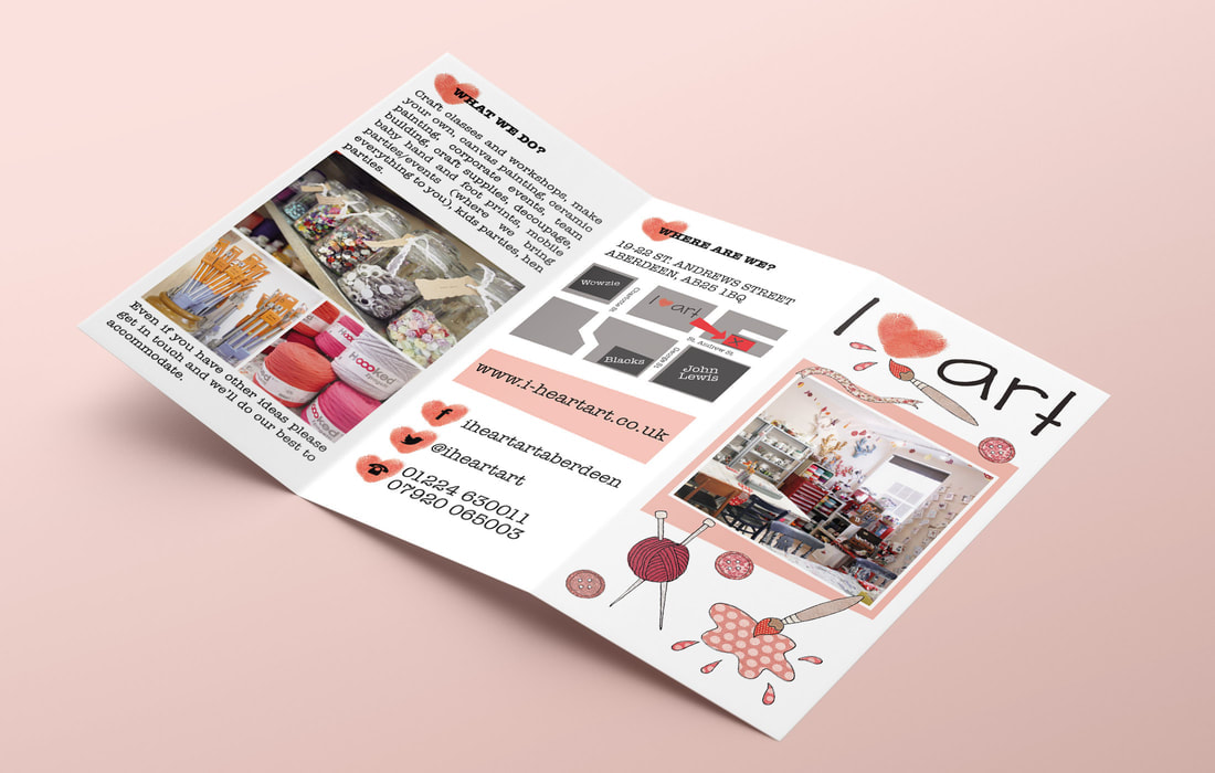
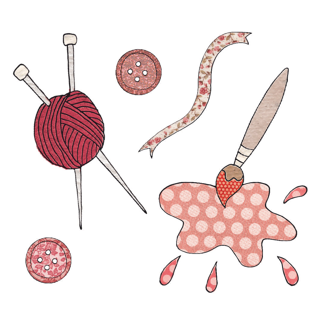
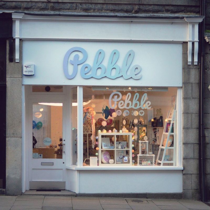 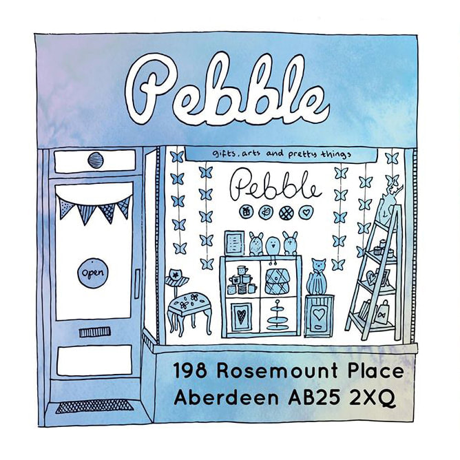 Pebble was an independent gift shop/gallery in Rosemount, Aberdeen which sold the work of Scottish designers and makers. It had the tagline: gifts, arts and pretty things. This was visually represented in the 'pebble' icons beneath the typography which were used throughout the branded items. The soft, ombre colour scheme was inspired by the coastal connections of the shop. The designs were used across the shop front from custom signage and vinyl window decal, to decorative hanging garlands and balloons for the opening weekend. Pebble offered gift wrapping and gift bags, so bespoke stamps and stickers were used to add a personal finishing touch. Pebble also commissioned an illustration to be used on flyers which represented their relationship with local designers more so than a photograph would. 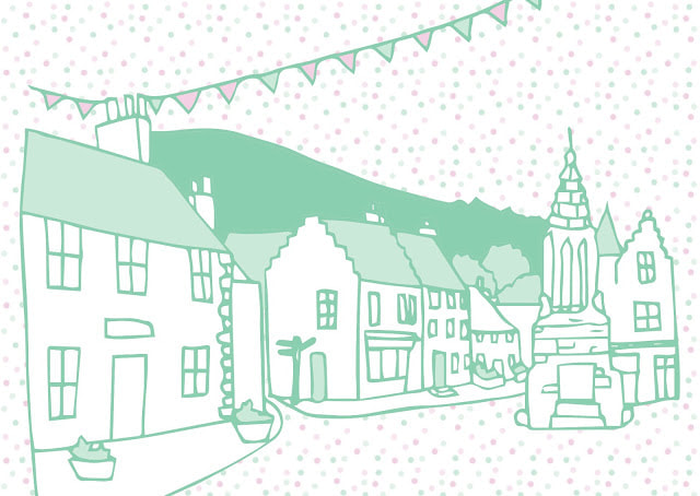 The Falkland Festival had a rebrand in 2015 and became the Falkland Midsummer Festival. The festival is a week of events put together by the community and businesses in Falkland. The picturesque village is decorated with bunting and there's lots of family friendly fun. We wanted the branding to have a really whimsical village garden party feel. The logo includes a geometric representation of the Falkland hill and village square bunting along with playful fonts. To compliment this, a simplified illustration of the iconic Falkland view was created which was then used throughout the festival promotional materials. The main programme was limited to a trifold flyer, it was put together with block patterned backgrounds for a patchwork effect which gave it the feel of a classic village fête. The decorative elements were to make it look fun for the whole family as many of the events were focussed on children's activities. If you'd like to book a rebrand you can do so here. I Heart Art was an arts and crafts studio in Aberdeen specialising in ceramic painting, crafty workshops and art classes. The owners were also big fans of vintage and upcycling so there was a lot of information to squeeze into one flyer! In the end, the design was kept quite minimal with colour blocks to help split the text sections. Since the logo was already very handmade looking I created some illustrations to compliment the style. These had patterned infills, including vintage floral fabrics to add to the crafty theme. If you'd like a similar style flyer designed you can get in touch here. Lisa Grace specialised in bespoke wedding stationery. The brief was to create an elegant yet simple logo, inspired by traditional wedding styles but with a modern feel. The calligraphy fonts gave a classic bridal look, paired a looped heart for a romantic vibe. As well as the logo, Lisa required design for business cards, stickers for orders and repeat pattern elements for packing up invitations with a personal touch. 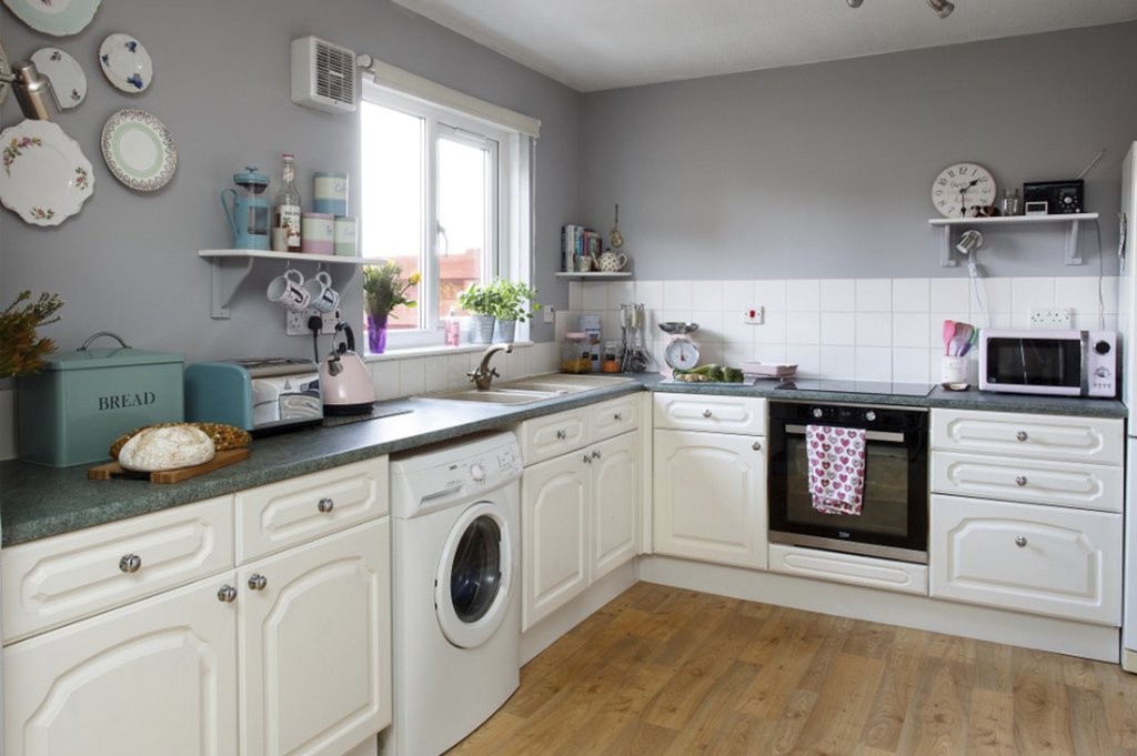 Before - Photograph by Douglas Gibb Photograph 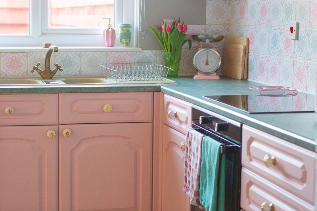 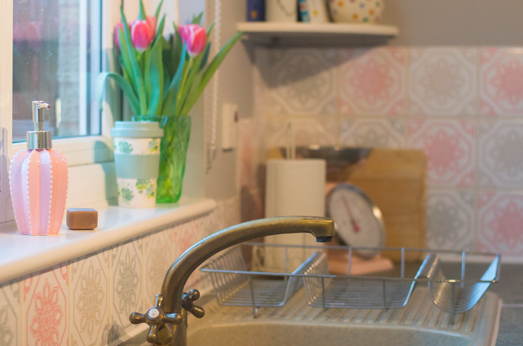 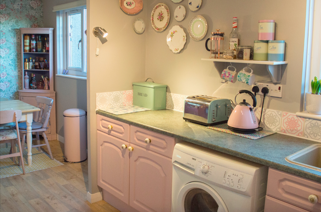 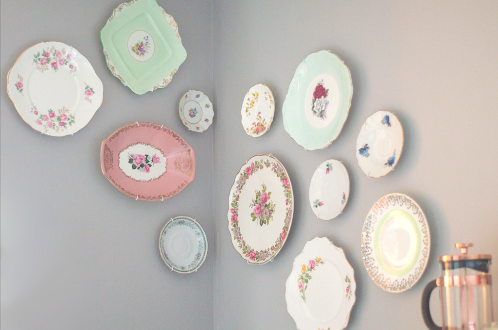 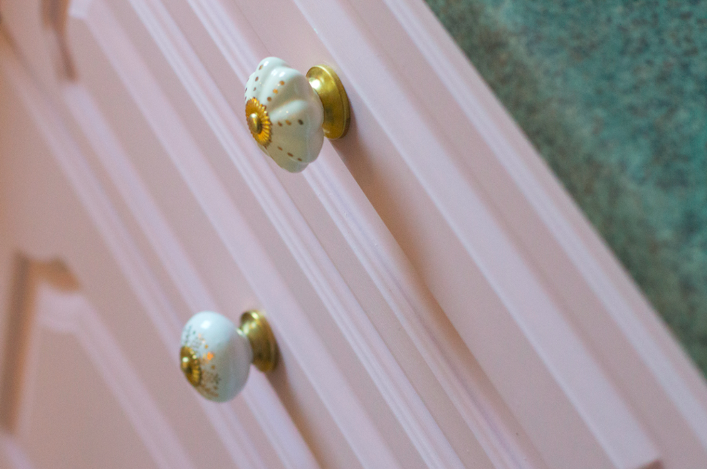 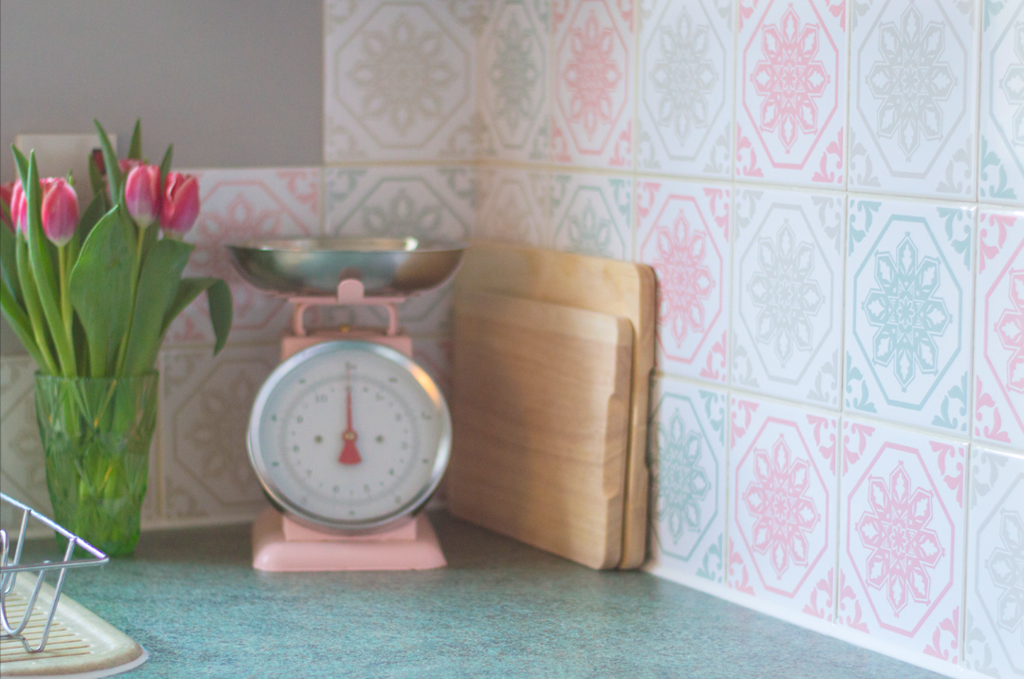 This post contains affiliate links to products. I may receive a commission for purchases made through these links. Happy new year! It's been a while but since we've just finished our mini kitchen makeover I thought it would be a nice post to start the year. It's now been over 15 months since we moved into our house, the kitchen wasn't top of the DIY list as it wasn't too bad, just a bit plain. We wanted to give it a cheap and cheerful revamp and since David had time off after new year, what better time to go for it than the holidays?? The original kitchen was in good shape (apart from a couple of wee joinery bits that David fixed) so after a deep clean and light sand we were ready to paint. The paint we used is Autentico Versante Matt in Antique Rose which was £26.95 for 1L - we had leftover after 2/3 coats. Autentico says it's ideal for kitchen cupboards and that its 'built-in moisture membrane and UV filter makes it water resistant and prevent colours from fading'. It's only been on a few days but I love the finish so hopefully it stays that way! To finish them off I chose some ceramic cream and gold drawer knobs which were from TK Maxx, I think they were £5.99 for 6. Of course, we have 13 kitchen cupboard handles but luckily I had a spare from another piece of furniture we upcycled last year! I spent a while looking at various options for the tiles and couldn't decide, so opted for tile stickers which are a much more affordable and less permanent solution if I change my mind anytime soon. These were from Wall Genie on Etsy and were just under £40 for three packs of 30 so I could have the mix of colours I wanted and some spares. I ordered a sample at the start of October and stuck it on to see how durable it was, and found no issues at all. They were a little fiddly to apply perfectly, especially around the sockets, but real tiles would've been much worse! Finally, we added to our vintage plates wall by hanging some diagonally up from the ones we hung when we moved in. I'm so pleased with the end result and it feels like such a happy space now. |
HelloHere you'll find my latest projects, behind the scenes, tips, DIY projects and more! Categories
All
Past Posts
October 2023
|